ShopDreamUp AI ArtDreamUp
Deviation Actions
Daily Deviation
Daily Deviation
April 21, 2010
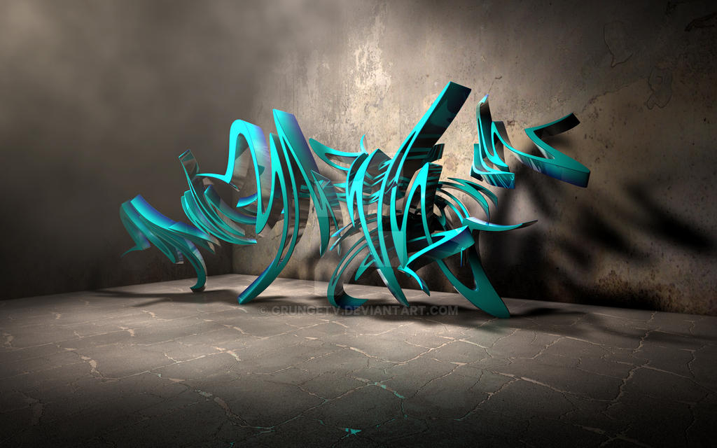
What totally caught my eye about Grabstract WP by =GrungeTV, was the fact that the digital elements added over the photgraphic ones, were so impressively done, that I had to strain my eye to look for a flaw. I found none. Job well done. This absolutely deserves to be on the desktop of anyone and everyone. Just... Don't stare too hard.
Featured by VSConcepts
Suggested by Lilyas
~ Special Supporter ~
Your support would mean a lot to me :)
Here you will find your picture, illustrations and much more, everything can be downloaded freely.
Support my work by contributing to my tip jar every month.
$1/month


Suggested Deviants


Suggested Collections


You Might Like…


Featured in Groups


Description
If you want to display my work on another site, you MUST provide a link back to the original.
Follow me on www.facebook.com/pages/GrungeTV
Please do not redistribute without my permission, thank you!
*EDIT: It just got a DD!!
Thanks to Lilyas for suggesting it, and thanks to VSConcepts for featuring it! Much appreciated guys!
---------------------------------------------------------
IMPORTANT © COPYRIGHT NOTICE
The work contained in my gallery is copyrighted © James Knowles. All rights reserved. My work may not be reproduced, copied, edited, published, transmitted or uploaded in any way without my written permission. If you have any doubts about this matter, or requests email me at jaykay73@hotmail.co.uk
Follow me on
Please do not redistribute without my permission, thank you!
*EDIT: It just got a DD!!
Thanks to Lilyas for suggesting it, and thanks to VSConcepts for featuring it! Much appreciated guys!
---------------------------------------------------------
IMPORTANT © COPYRIGHT NOTICE
The work contained in my gallery is copyrighted © James Knowles. All rights reserved. My work may not be reproduced, copied, edited, published, transmitted or uploaded in any way without my written permission. If you have any doubts about this matter, or requests email me at jaykay73@hotmail.co.uk
Image size
2560x1600px 2.93 MB
© 2010 - 2024 GrungeTV
Comments198
Join the community to add your comment. Already a deviant? Log In
What stands out the most in this image is how it pops off the background. Stylistically, it appears as graffiti. However, it feels alive and dynamic, as if it were about to strike or flee at any moment. If it were a sculpture, it probably would be made of metal, jagged yet polished. The pairing of colours is done very well; the candy gloss turquoise contrasts so well against the concrete grey.
The only odd bit I find in this work is the smokiness that obscures the top half of the corner so that you cannot see the fold of the wall. It gives the image an area of specific blurriness when everything else is so crisp and distinct.
Excellent work on the image. Very well done.