ShopDreamUp AI ArtDreamUp
Deviation Actions
Daily Deviation
Daily Deviation
October 4, 2011
COLOR Primer - :Color + Value: by =ziinyu
Featured by shelldevil
Suggested by CaryM


Suggested Deviants


Suggested Collections


![[Quick Trick] Back Light](https://images-wixmp-ed30a86b8c4ca887773594c2.wixmp.com/f/48c23bda-8da4-44ba-b256-05775461ea53/d7smamx-09de0710-423e-487c-9b7b-687cb44ec248.jpg/v1/crop/w_184,h_184,x_0,y_328,scl_0.23,q_70,strp/_quick_trick__back_light_by_fuyudust_d7smamx-92s-2x.jpg?token=eyJ0eXAiOiJKV1QiLCJhbGciOiJIUzI1NiJ9.eyJzdWIiOiJ1cm46YXBwOjdlMGQxODg5ODIyNjQzNzNhNWYwZDQxNWVhMGQyNmUwIiwiaXNzIjoidXJuOmFwcDo3ZTBkMTg4OTgyMjY0MzczYTVmMGQ0MTVlYTBkMjZlMCIsIm9iaiI6W1t7ImhlaWdodCI6Ijw9NjUwMCIsInBhdGgiOiJcL2ZcLzQ4YzIzYmRhLThkYTQtNDRiYS1iMjU2LTA1Nzc1NDYxZWE1M1wvZDdzbWFteC0wOWRlMDcxMC00MjNlLTQ4N2MtOWI3Yi02ODdjYjQ0ZWMyNDguanBnIiwid2lkdGgiOiI8PTgwMCJ9XV0sImF1ZCI6WyJ1cm46c2VydmljZTppbWFnZS5vcGVyYXRpb25zIl19.u8pdE2WyrO4YiSNLP_-0OzwAZd7kmgdpmUYf1U3Yo-0)
![[Quick Trick] Back Light](https://images-wixmp-ed30a86b8c4ca887773594c2.wixmp.com/f/48c23bda-8da4-44ba-b256-05775461ea53/d7smamx-09de0710-423e-487c-9b7b-687cb44ec248.jpg/v1/crop/w_92,h_92,x_0,y_164,scl_0.115,q_70,strp/_quick_trick__back_light_by_fuyudust_d7smamx-92s.jpg?token=eyJ0eXAiOiJKV1QiLCJhbGciOiJIUzI1NiJ9.eyJzdWIiOiJ1cm46YXBwOjdlMGQxODg5ODIyNjQzNzNhNWYwZDQxNWVhMGQyNmUwIiwiaXNzIjoidXJuOmFwcDo3ZTBkMTg4OTgyMjY0MzczYTVmMGQ0MTVlYTBkMjZlMCIsIm9iaiI6W1t7ImhlaWdodCI6Ijw9NjUwMCIsInBhdGgiOiJcL2ZcLzQ4YzIzYmRhLThkYTQtNDRiYS1iMjU2LTA1Nzc1NDYxZWE1M1wvZDdzbWFteC0wOWRlMDcxMC00MjNlLTQ4N2MtOWI3Yi02ODdjYjQ0ZWMyNDguanBnIiwid2lkdGgiOiI8PTgwMCJ9XV0sImF1ZCI6WyJ1cm46c2VydmljZTppbWFnZS5vcGVyYXRpb25zIl19.u8pdE2WyrO4YiSNLP_-0OzwAZd7kmgdpmUYf1U3Yo-0)


You Might Like…


Featured in Groups


Description
COLOR THEORY : Primer (v 0.1) 9/29-10
Submitted to #contribution-box : 8/26-10
This is not a technique tutorial, it is a formal introduction to the principles of Color Theory, that can be applied across all visual media. The goal of this tutorial is to provide a reference source for discussion about color theory as well as value development.
PART 1 - COLOR
When we talk about a color, what do we mean? Is it a Hue? A Value? Perhaps a Saturation?
(Notice how all of these properties are relative to some standard or themselves, this is one of the key attributes of color theory, but often goes the most neglected.)
In reality color refers to all of these things, and as a result the range of the Visible Spectrum is quite expansive. Quite often the grayscale swatches are not referred to as colors, but for the purpose of this tutorial we will use them interchangeably with colors. So how do we organize all of these colors, recognize them, recreate them. and most importantly utilize them? The answer is dependent on the Color Space in which we are working.
1A : Color Space
The term "color space" refers to a collection of the visible spectrum that can be represented by a combination of primary colors. This means that a color space doesn't actually represent all colors that can be seen by the human eye, it forms an approximation (of course the visible spectrum can be thought of as an individual color-space, just a complete, expansive space).
Now it is important to note that most color spaces that come close to approximating the visible spectrum use at least three distinct axes. Be they CMYK or RGB or even HSV, whatever the primaries of a color space, they define the total range of colors available to that space. These are just the common color spaces that have been used because they are easy to reproduce, they are to some extent standardized. Really, there are infinitely many color spaces, and often you have the need to create your own. Take the act of painting with a limited starting palette. If you initiate your painting with the pigments of Burnt Sienna, Phthalo Green, and Titanium White, you have provided yourself with a color space, that is, all colors that can be created by blending those three primaries. This means that colors exist in three dimensions, but in most media we can only actualize and visualize them in two. Be certain not to limit your spectrum to your chosen visualization method.
Common color spaces :
Color profile refers to a specific method of referring to a distinct color (for example, sRGB or Pantone), while a color interface is a method of visualizing a large range of colors. A common color interface is that of the Color Wheel, and for good reason, it allows us to view distinctly at least two of the three axes of our color space, and extrapolate the third.
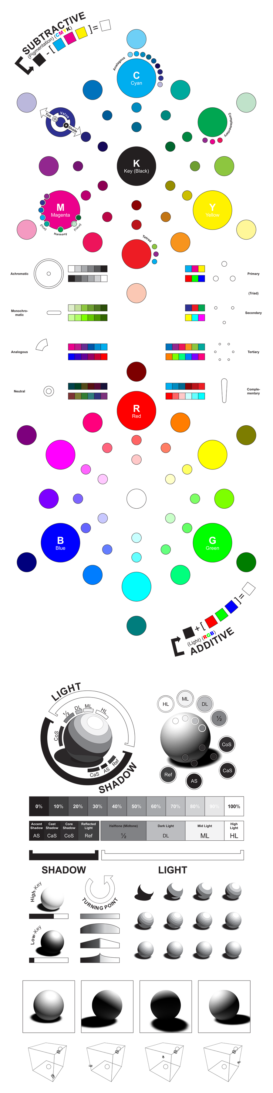
1B : Color Wheel
Two color wheels have been provided above, one for the subtractive standard (CMYK) and on for the additive standard (RGB). Outside of the standard ring of pure hues tints and shades have been added to indicate the nature of the blending. Please be aware that the creation of a color wheel requires decisions about axes to be determined, and as it is only a projection, some things must naturally be left out. These wheels use the standard pure hue outer ring and mix to pure white and pure black in the center (rather than directly blending across, developing a gray in the center for a CMYK color wheel), this means that the neutral colors do not exist in this projection.
So the color wheel, why do we use it? Firstly because it is a simple method of showing many colors as related to hue and value (or saturation, if we choose to create our color wheel). Secondly because, being circular in nature, it lends itself to simple color scheme palette selection and harmony creation techniques. Before we get too far into harmonies and color contrasts, let's define the parts of the color wheel.
Aside from simply locating elements, hues, tints, and shades, the color wheel's great strength comes from the ability it gives us to visualize color relationships. The true strength in color material, versus simple black and white gradations, is in the depth and complexity of color relationships. When designing a piece, the artist creates a color scheme that reflects both the content and the concept of the piece. This allows them to add yet another level to their composition (in addition to shape layout and value), that of color interaction. Certain colors when placed in relation to others will visually become striking (contrast), advance or recede (temperature), or create unity or discord (harmony and disharmony). By manipulating and carefully selecting the colors of a piece (and their use within it) the artist is given a distinct and expansive set of tools with which to communicate their art.
Submitted to #contribution-box : 8/26-10
This is not a technique tutorial, it is a formal introduction to the principles of Color Theory, that can be applied across all visual media. The goal of this tutorial is to provide a reference source for discussion about color theory as well as value development.
col·or noun, often attributive \ˈkə-lər\
- A phenomenon of light (as red, brown, pink, or gray) or visual perception that enables one to differentiate otherwise identical objects
- The aspect of the appearance of objects and light sources that may be described in terms of hue, lightness, and saturation for objects and hue, brightness, and saturation for light sources <the changing color of the sky>; also : a specific combination of hue, saturation, and lightness or brightness <comes in six colors> (2) : a color other than and as contrasted with black, white, or gray
- Merriam Webster Online Dictionary
PART 1 - COLOR
When we talk about a color, what do we mean? Is it a Hue? A Value? Perhaps a Saturation?
Hue
The identity of a color as defined by its relationship to what are considered the "pure hues" (RED, ORANGE, YELLOW, GREEN, BLUE, VIOLET, etc.).
Saturation (Intensity, Chroma)
How intense or dull a color appears relative to other iterations of itself. The "pure hues" are considered to be highest saturation in that hue, with all other tints and shades being of a lowered saturation.
Value (Lightness, Darkness)
How a color relates to pure white and pure black. This interacts distinctly with hue and saturation as in the two common color spaces (CMYK and RGB) the values of the primaries are not equal.
(Notice how all of these properties are relative to some standard or themselves, this is one of the key attributes of color theory, but often goes the most neglected.)
In reality color refers to all of these things, and as a result the range of the Visible Spectrum is quite expansive. Quite often the grayscale swatches are not referred to as colors, but for the purpose of this tutorial we will use them interchangeably with colors. So how do we organize all of these colors, recognize them, recreate them. and most importantly utilize them? The answer is dependent on the Color Space in which we are working.
1A : Color Space
The term "color space" refers to a collection of the visible spectrum that can be represented by a combination of primary colors. This means that a color space doesn't actually represent all colors that can be seen by the human eye, it forms an approximation (of course the visible spectrum can be thought of as an individual color-space, just a complete, expansive space).
Now it is important to note that most color spaces that come close to approximating the visible spectrum use at least three distinct axes. Be they CMYK or RGB or even HSV, whatever the primaries of a color space, they define the total range of colors available to that space. These are just the common color spaces that have been used because they are easy to reproduce, they are to some extent standardized. Really, there are infinitely many color spaces, and often you have the need to create your own. Take the act of painting with a limited starting palette. If you initiate your painting with the pigments of Burnt Sienna, Phthalo Green, and Titanium White, you have provided yourself with a color space, that is, all colors that can be created by blending those three primaries. This means that colors exist in three dimensions, but in most media we can only actualize and visualize them in two. Be certain not to limit your spectrum to your chosen visualization method.
Common color spaces :
- CMYK Subtractive (Pigmentation)
This space refers to the physical spectrum, colors that are created with pigments. Painting hues can be represented within this spectrum (be the medium oil, acrylic, encaustic, watercolor, etc.). This specific color profile is used for printing purposes as it uses the three primary colors of ink (CYAN, MAGENTA, YELLOW) (as well as a key, BLACK) that have become standards in the print industry (electric printing as well as screen printing and other manual methods).
This is a Subtractive color space, the colors must be subtracted from black to generate a white surface.
(A simulation of a CMYK color wheel is shown above - simulation as it is CMYK as interpreted by the RGB used in the color space of LCD monitors.) - RGB Additive (Light)
This is a spectrum referring to light as defined by the primaries (RED, GREEN, and BLUE). This spectrum is used for the digital industry, as LCD screens work based on a combination of these three primaries being combined within each "pixel".
This is an Additive color space, the colors must be added to black to generate a white light. - HSV (HSB)
This uses a polar representation of color. The hue is indicated in a number of degrees, while saturation and value distinguish a unique two dimensional color space for each hue.
Color profile refers to a specific method of referring to a distinct color (for example, sRGB or Pantone), while a color interface is a method of visualizing a large range of colors. A common color interface is that of the Color Wheel, and for good reason, it allows us to view distinctly at least two of the three axes of our color space, and extrapolate the third.
1B : Color Wheel
Two color wheels have been provided above, one for the subtractive standard (CMYK) and on for the additive standard (RGB). Outside of the standard ring of pure hues tints and shades have been added to indicate the nature of the blending. Please be aware that the creation of a color wheel requires decisions about axes to be determined, and as it is only a projection, some things must naturally be left out. These wheels use the standard pure hue outer ring and mix to pure white and pure black in the center (rather than directly blending across, developing a gray in the center for a CMYK color wheel), this means that the neutral colors do not exist in this projection.
So the color wheel, why do we use it? Firstly because it is a simple method of showing many colors as related to hue and value (or saturation, if we choose to create our color wheel). Secondly because, being circular in nature, it lends itself to simple color scheme palette selection and harmony creation techniques. Before we get too far into harmonies and color contrasts, let's define the parts of the color wheel.
Primary (Axes)
The primary colors are named as such because they are the purest of colors, they cannot be formed by any combination of colors in the color space.
Why is it that cyan-blue and cyan-green do not combine to create cyan? The answer is that the color of pure cyan is unchanged by the inclusion of any other color. If we combine a color composed of cyan and magenta as well as cyan and yellow we end up with a color containing all of these primaries. In reality, instead of creating cyan we have created a darker, more neutral, and less saturated shade of cyan, but not the primary itself.
Primaries are considered "pure hues".
The color wheel shown above is based off of a CMYK color space, but the RYB (RED, YELLOW, BLUE) color wheel is traditionally used to represent pigmentation.
Secondary
The secondaries are the next most pure colors, they are created by mixing equal parts of two of the primaries.
Secondaries are considered "pure hues".
Pure Hue
The circle that contains the secondaries and the primaries is considered the circle of pure hues, it is the circle of highest visible saturation on the color wheel. Other circles in the color wheel concentric to this one contain the same hue distribution but vary in value and saturation.
Traditionally, this circle is the outer bound of the color wheel, as showing the outer tints or shades (depending on subtractive or additive) would create too much imbalance in the overall value representation of the color wheel.
Tertiary
Any color that exist in the circle of pure hues that is not a primary or a secondary is considered a tertiary color, or the third level of a pure color. As with secondaries, tertiaries are composed of only two primaries, but not in equal ratio.
Traditionally we think of six tertiary colors as those hues located halfway in between a primary and a secondary. When using a RYB color wheel (the most common pigmentation wheel, but more limited than CMYK) these are the colors with hyphenated names (Blue-Green, Yellow-Orange, etc.).
Tint
A tint is any color that has been shifted closer to white, it is a lighter version of the initial hue. Tint can be used as a global term (anything lighter than the pure hues) or locally (lighter than a relative hue).
To create a tint of a pigment color, it must be used in lower opacity or be added to a white pigment.
To create a tint of a color of light, a ratio of the primaries (RGB) must be added to the current color. If an equal part of each is added a desaturated tint will be created, while if they are scaled relatively (a zero value remains zero) a brighter version of a darker color will be created, retaining or increasing relative saturation. This means that a tint of a fully saturated color must be lower in saturation (the same occurs in the HSV color space).
Shade
A shade is any color that has been shifted closer to black, it is a darker version of the initial hue. Shade can be used as a global term (anything darker than the pure hues) or locally (darker than a relative hue).
To create a shade of a pigment color, it must be added to a darker pigment (in CMYK this is the Key, or BLACK) or mixed with the compliment. Mixing a hue with a compliment actually produces a neutral color, closer to a gray or an earth tone, and while creating a shade of the original hue, it also adjusts the saturation.
To create a shade of a color of light, less of the primaries (RGB) must be used while retaining the current ratio (changing the relative saturation), or removing an equal portion of each (changing the hue but retaining the saturation).
Neutral
A neutral color is a color that does not exist naturally within the projected color wheel, but still has a place in the color space.
In pigmentation, a neutral is formed of all of the primaries used in unequal (or even equal) proportion.
In light, a neutral is created by adjusting a hue linearly (not to scale) from its current position, usually creating an unbalanced ratio between the three primaries.
Aside from simply locating elements, hues, tints, and shades, the color wheel's great strength comes from the ability it gives us to visualize color relationships. The true strength in color material, versus simple black and white gradations, is in the depth and complexity of color relationships. When designing a piece, the artist creates a color scheme that reflects both the content and the concept of the piece. This allows them to add yet another level to their composition (in addition to shape layout and value), that of color interaction. Certain colors when placed in relation to others will visually become striking (contrast), advance or recede (temperature), or create unity or discord (harmony and disharmony). By manipulating and carefully selecting the colors of a piece (and their use within it) the artist is given a distinct and expansive set of tools with which to communicate their art.
Contrast
Color contrast is similar to value contrast (in fact contains it as a subset if the grayscale range is considered to be within the color space). The contrast between two elements is their distance in their color space.
As color has three elements (Hue, Saturation, and Value), there are three ways in which two colors may be contrasted.
- Hue : Colors that have opposing hues (called complementary colors) have the highest level of hue contrast, while close hues (called analagous colors) have a low hue contrast. Hue contrast is not as strong as value contrast, but still quite apparent if properly used in a composition. In a color wheel representation, hue contrast is the angular distance between two colors (the smaller the angle the lower the contrast - the higher the greater the contrast).
- Value : The value contrast is the difference in the lightness and darkness of two colors. A very light color (10% gray in value) appears very prominently against a dark color (90% gray in value) (high contrast) but rather dull against a color with similar value (15% gray in value) (low contrast). This is the strongest of the three forms of color contrast, it has its basis in grayscale value contrast. In a color wheel, this is the radial distance between two colors.
- Saturation : This is a contrast between the intensities of colors. A very bright color (such as a pure hue) will have high contrast with a dull color (such as a tint or a neutral). This is the weakest of the forms of color contrast
As there are three distinct forms of color contrast, combining them allows for many levels of contrast between colors. Colors may contrast on one level, many different levels, all levels, or none. Two diametrically opposite colors (in contrast, not in the color wheel) will contrast on all levels (such as a bright, intense violet, and a dull dark yellow), while two close colors may only differ slightly on each (such as a simple blue, and slight tint of cyan).Simultaneous Contrast
An effect which occurs when two colors are identical on two of the three axes and perfect opposites on the last. Primarily this is seen when two distinctly different hues (such as complements) have exactly the same intensity and value. It results in a strong discomfort and creates the illusion of chaotic interaction. If used intentionally, it can be used to impress upon the viewer an unsettling feeling.
Temperature
Color temperature is both used in a global color sense (relating a single color to the entire color space), and in a localized sense (relating a color to another adjacent color. It groups warm colors and cool colors and allows certain relative statements about each group to be made. Effectively, the warm/cool structure divides the color wheel (and concurrently color space) in half and allows the entirety of each half to be treated as a complement to the other half.
- Warm Color : RED, YELLOW, ORANGE
The warm colors lie around the red/yellow area of the color wheel. Warms are generally thought to advance in perceived space. In the spectrum of visible light, this shift happens between yellow and green. It is important to distinguish that even within the warm half of the spectrum, there may be relative warmth, with red generally being regarded as warmer than yellow (though this may be affected by saturation variances).- Cool Color : BLUE, GREEN, VIOLET (equivalent of Magenta in light)
The cool colors lie around the blue/green area of the color wheel. Cools are generally thought to recede in perceived space. In the spectrum of visible light, this shift happens between yellow and green. It is important to distinguish that even within the cool half of the spectrum, there may be relative coolness, with blue generally being regarded as cooler than green or violet (though this may be affected by saturation variances).
Warmth and Coolness are often considered in the effects of light and shadow (as they are attributed to the spectrum of light emitted by a black body, though the actual temperature scale has been reversed). A warm light will leave cool cast shadows, while a cool light will leave warm ones (really each will leave the direct complement in the additive/light color space). Usually this effect is very slight and will only be noticed in an exceedingly warm or cool lighting situation, but an artist may manipulate the effect to accent the contrast (hue contrast) between the light and shadow halves of an object.
TODO :
- Show approximate location of RGB in CMYK and the reverse (on the color wheels).
- Create a CIE comparison chart of the ranges of standard color spaces relative to the visible spectrum.
- Show more color relationships and harmonies.
- Describe and show examples of simultaneous contrast and other disharmony effects.
- Write value section of tutorial.
- Create chart showing approximate values of the pure hues.
- Create bounced light diagrams for hue relations through RGB in light.
- Create a set of exercises for the tutorial.
- Find links as example material (to the classics, some Renaissance, some Fauvism, and some of the Modernist Color Theorists).
- Link resources to other tutorials, diagrams, demonstrations, and instructional material (likely will simply link to the Color + Value page of the Index in #contribution-box - with a list of a direct bibliography used.
Image size
1200x4793px 999.42 KB
© 2010 - 2024 ziinyu
Comments185
Join the community to add your comment. Already a deviant? Log In
Omg so amazing 😍 duh colors