ShopDreamUp AI ArtDreamUp
Deviation Actions


Description
I am declaring this image to be complete.
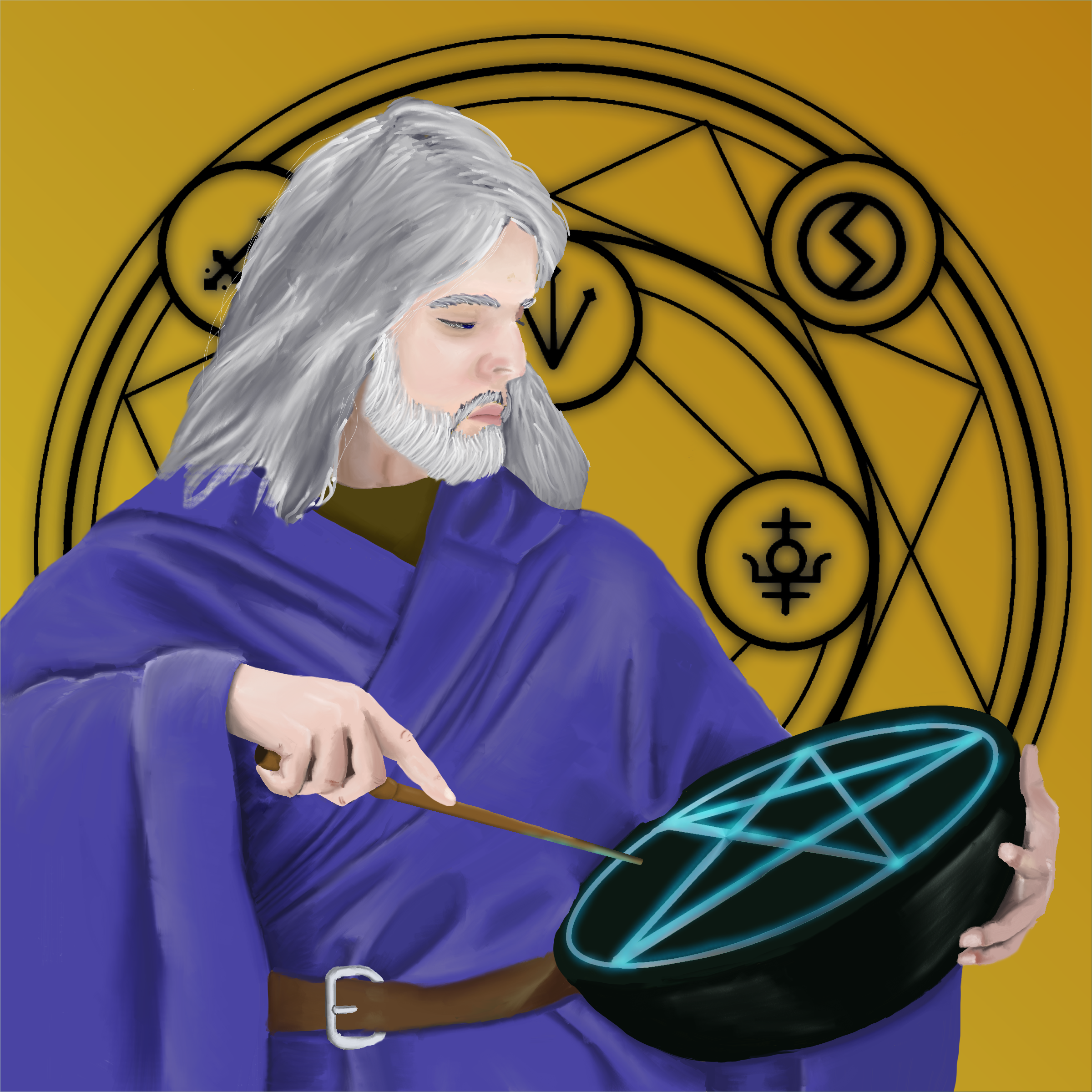
Figure drawing and painting is something I have very little experience doing, so this was a frustrating, educational, and entertaining experience.
The intention here is to use this as a character portrait for one of my NPCs in my D&D campaign.
Resources used:


12-16 hours, Corel Painter 11.
Full size: 2400x2400
I'm releasing this image under a Creative Commons by-nc license, so feel free to use it if you like it, as long as it's not for monetary gain.
Figure drawing and painting is something I have very little experience doing, so this was a frustrating, educational, and entertaining experience.
The intention here is to use this as a character portrait for one of my NPCs in my D&D campaign.
Resources used:
12-16 hours, Corel Painter 11.
Full size: 2400x2400
I'm releasing this image under a Creative Commons by-nc license, so feel free to use it if you like it, as long as it's not for monetary gain.
Image size
2400x2400px 3.68 MB
Comments10
Join the community to add your comment. Already a deviant? Log In
It's good to see you try different subjects and themes with your artwork. I like the character and pose you've chosen, and you have managed to make the traveller/wizard have quite a different expression from the reference image - he looks a tad arrogant actually, as if he's saying "this spell is so simple I can't see why *I* should have to lower myself to do it?" <img src="e.deviantart.net/emoticons/s/s…" width="15" height="15" alt="
Of course this is all only my personal opinion - but I must say that I feel this image to be a bit unfinished. You have a good anatomy, nice folds of his clothes and even a cool expression going - it just looks like you stopped before adding the final touches. Many of my images look similar to this after having finished working in MyPaint, before taking the image into GIMP for post-processing.
Now, I'm a fan of contrasts myself, and to me there is no real contrast in this image, and no colour matching between foreground and background. There are no shadows, in fact the background pattern "pops" more than the foreground character.
Having a simple background is fine, but you should really consider putting a "coloured glass plate" layer in front of the image and blend it in with some suitable mode to force the image to the same colour tone. Going over the image with a Multiply-layer to add self-shadowing and contrasts to the chararacter would also help make it stand out more; and making the edges darker would make it even more so. Adding global light and shadows (maybe even have the guy cast a shadow on the background?) would make him more 3D too.
... Again, just my personal opinions. Note that I like the image as a whole. It just feels like you have a great image in the works here and you just stopped just short of finalizing it. This makes impact considerably lower than it need be.
.
Griatch