ShopDreamUp AI ArtDreamUp
Deviation Actions


![Sleek Photography Journal Skin [ Purple ]](https://images-wixmp-ed30a86b8c4ca887773594c2.wixmp.com/f/3d6f0448-4582-46d1-be30-34367dcfb7e9/d656zxs-377e879c-7d82-4d41-9321-544cc66b0e4a.jpg/v1/crop/w_184,h_184,x_0,y_41,scl_0.17898832684825,q_70,strp/sleek_photography_journal_skin___purple___by_kovowolf_d656zxs-92s-2x.jpg?token=eyJ0eXAiOiJKV1QiLCJhbGciOiJIUzI1NiJ9.eyJzdWIiOiJ1cm46YXBwOjdlMGQxODg5ODIyNjQzNzNhNWYwZDQxNWVhMGQyNmUwIiwiaXNzIjoidXJuOmFwcDo3ZTBkMTg4OTgyMjY0MzczYTVmMGQ0MTVlYTBkMjZlMCIsIm9iaiI6W1t7ImhlaWdodCI6Ijw9MTkzNCIsInBhdGgiOiJcL2ZcLzNkNmYwNDQ4LTQ1ODItNDZkMS1iZTMwLTM0MzY3ZGNmYjdlOVwvZDY1Nnp4cy0zNzdlODc5Yy03ZDgyLTRkNDEtOTMyMS01NDRjYzY2YjBlNGEuanBnIiwid2lkdGgiOiI8PTEwMjgifV1dLCJhdWQiOlsidXJuOnNlcnZpY2U6aW1hZ2Uub3BlcmF0aW9ucyJdfQ.7czzMDB1oMARlA-NQCrhUZMyVGUsbFDNs0RB_8bQlEI)
![Sleek Photography Journal Skin [ Purple ]](https://images-wixmp-ed30a86b8c4ca887773594c2.wixmp.com/f/3d6f0448-4582-46d1-be30-34367dcfb7e9/d656zxs-377e879c-7d82-4d41-9321-544cc66b0e4a.jpg/v1/crop/w_92,h_92,x_0,y_20,scl_0.089494163424125,q_70,strp/sleek_photography_journal_skin___purple___by_kovowolf_d656zxs-92s.jpg?token=eyJ0eXAiOiJKV1QiLCJhbGciOiJIUzI1NiJ9.eyJzdWIiOiJ1cm46YXBwOjdlMGQxODg5ODIyNjQzNzNhNWYwZDQxNWVhMGQyNmUwIiwiaXNzIjoidXJuOmFwcDo3ZTBkMTg4OTgyMjY0MzczYTVmMGQ0MTVlYTBkMjZlMCIsIm9iaiI6W1t7ImhlaWdodCI6Ijw9MTkzNCIsInBhdGgiOiJcL2ZcLzNkNmYwNDQ4LTQ1ODItNDZkMS1iZTMwLTM0MzY3ZGNmYjdlOVwvZDY1Nnp4cy0zNzdlODc5Yy03ZDgyLTRkNDEtOTMyMS01NDRjYzY2YjBlNGEuanBnIiwid2lkdGgiOiI8PTEwMjgifV1dLCJhdWQiOlsidXJuOnNlcnZpY2U6aW1hZ2Uub3BlcmF0aW9ucyJdfQ.7czzMDB1oMARlA-NQCrhUZMyVGUsbFDNs0RB_8bQlEI)


Description
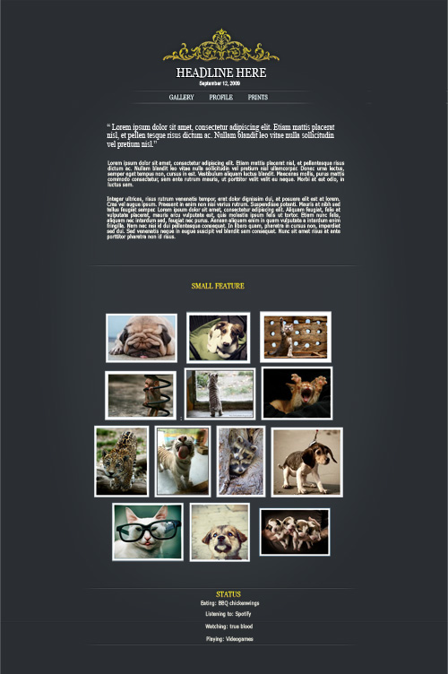
Royal gold Journal skin
This is my first journal skin and all CSS and graphics is by me.
Watch Live Preview Here: [link]
This Skin is simple to install and is has has four special features!
 Nice menu
You can write fancy Quotes!
Put divider lines where ever you want!
And have headlines and text in luxury GOLD!
HOW TO:
Use features
All the code you need is in the skin. All you have to do is copy and paste if you want to use any of the features.")
Use Menu
And if you want the links to your profile just change "username" to you own.
I hope you like it! Please comment and check out my other submissions too.
Check out my other skin to (Smile)")

Note: PLEASE make it a Favourite too if you install it!</font>
This is my first journal skin and all CSS and graphics is by me.
Watch Live Preview Here: [link]
This Skin is simple to install and is has has four special features!
HOW TO:
Use features
All the code you need is in the skin. All you have to do is copy and paste if you want to use any of the features.
Use Menu
And if you want the links to your profile just change "username" to you own.
I hope you like it! Please comment and check out my other submissions too.
Check out my other skin to
Note: PLEASE make it a Favourite too if you install it!</font>
© 2010 - 2024 Swebliss
Comments76
Join the community to add your comment. Already a deviant? Log In
I love the cleanliness, It's one of the first things I look for in any design. How things flow and work together.
Things I would change: (there aren't many)
I would move the status back to either left or right justified. and possibly add the same image reversed at the bottom. The text is easily read, but a little contrast between the text and the link would be wonderful. I would say that the white text looks good, but the same golden yellow for links.
I also would say that if you reversed the colours and had a yellow or white background, with dark text and dark graphics, and the links in a lighter colour, I would like it a lot better, and not hesitate to use it in my journal