ShopDreamUp AI ArtDreamUp
Deviation Actions


Suggested Deviants


Suggested Collections


You Might Like…


Featured in Groups

Description
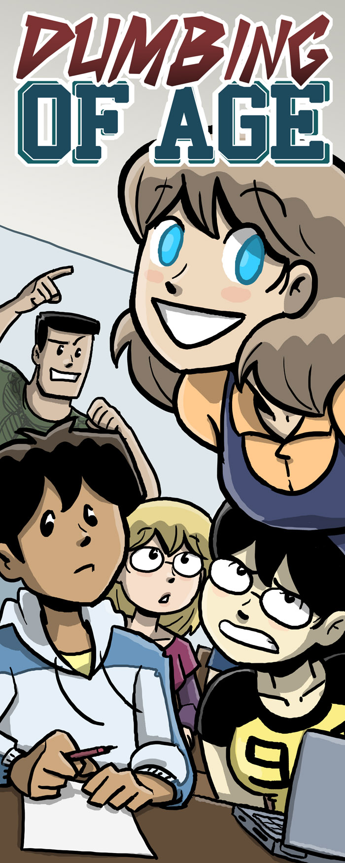
Here's my possibly final DoA convention banner image, pending Maggie getting home and telling me I'm insane.
Most people liked #3 best, as did I, but I also agreed with the critics of #3 (Jeph Jacques among them) that it could potentially be too busy. This IS a convention banner, and it should work well from far away, so keeping it simple and readable is the key. So I finished #3 with that in mind.
I shrunk Joe so that there was more negative space around Joyce, who needs to be the most important. She (along with the logo) are what folks will see from the other side of the aisle or hall or whatever. Stuff below that is more complicated, for the folks who are walking along our table. I simplified that stuff as well, trying to get the characters at an angle where I wouldn't have to draw the head-tops of the other people in this fictional classroom. I also kept the classroom walls bare of posters and what have you, further strengthening the negative space around Joyce. Everyone's also staring and/or pointing at Joyce, which overall kind of makes a big arrow towards the logo again, which is nice.
Also, hey, there's at least 4 or 5 boobs in this shot, so sweet.
Image size
700x1750px 312.92 KB
© 2011 - 2024 itswalky
Comments10
Join the community to add your comment. Already a deviant? Log In
It's nice, but I'm not quite sure what's going on with Billie. The headtilt/eyeroll/snarl look a bit awkward when put together. It kind of looks like Joyce is a giant, and she's physically leaning on Billie. That's why she's making that face.