ShopDreamUp AI ArtDreamUp
Deviation Actions
Suggested Deviants
Suggested Collections
You Might Like…
Featured in Groups
Description
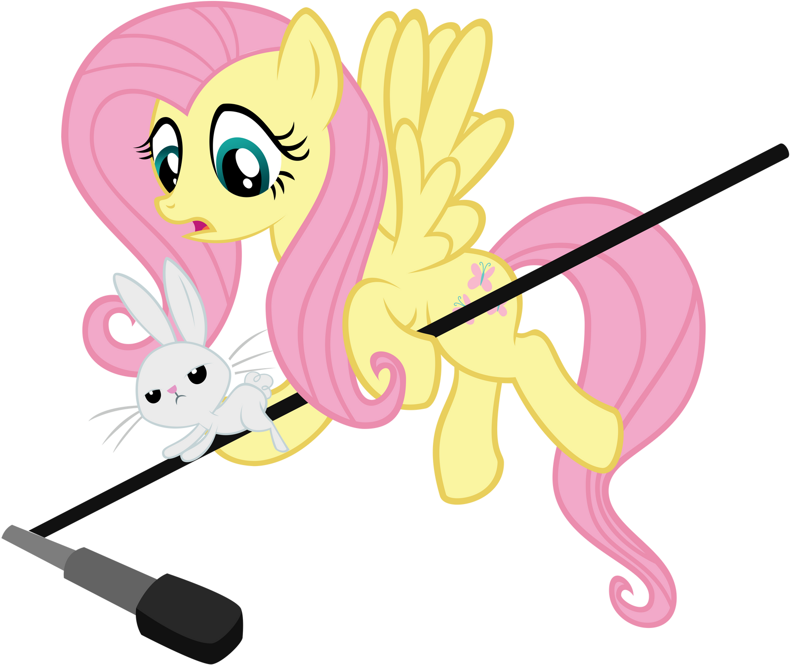
Garrett Gilchrist ( ) drew it, I vectored
I really like how this turned out It took a bit but it's simple and divine
  Have a behind-the-scenes [link]
Please leave comments and critiques! I want to know what you guys like and what I need to improve on!
More ponies incoming!
I really like how this turned out
Please leave comments and critiques! I want to know what you guys like and what I need to improve on!
More ponies incoming!
Image size
12190x10262px 2.91 MB
© 2011 - 2024 Gratlofatic
Comments11
Join the community to add your comment. Already a deviant? Log In
Alright, I apologize if I'm being a jerk. This is the first critique I've ever written.
There are a few problems with this piece, like with any piece. The wing stroke is a little thicker than the rest, and the face stroke a little thin (it's all relative). It's best to use the ellipse tool for the eyes, and even if the original artist didn't draw an accent or highlight for the eyes, it might be better to put those in yourself. The gradient for the right eye is pointing the wrong way. There are a few problems with fill on Fluttershy's neck and mane (right on the top of her head), and on Angel's ear.
Otherwise, this is perfect. The most important part of vectoring ponies is stroke width consistency. In general, the more consistent the stroke, the better-looking the vector. You do a brilliant job of making the stroke look sublime, even if the width of one line may be bigger or smaller than the next, the width within that one line is perfectly uniform all the way through. The cutie mark is handled excellently, and Angel is done with exceptional quality. Great job, dude!


