ShopDreamUp AI ArtDreamUp


Suggested Deviants


Suggested Collections


You Might Like…


Featured in Groups


![[link]](https://www.deviantart.com/users/outgoing?http://24.media.tumblr.com/tumblr_m4anyi9qmG1qhttpto4_500.jpg)
Comments105
Join the community to add your comment. Already a deviant? Log In
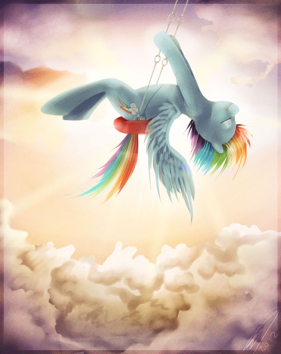
*Warning. Essay long critique*
I have to be honest, when I was in the midst of comparing this picture to the original piece you were emulating I was really hoping to scroll down and see the option to critique it, because this seemed like a picture which deserved some more advanced input. So already you get bonus points! <img src="e.deviantart.net/emoticons/b/b…" width="15" height="15" alt="
Firstly, the proportions here are very well done. I am personally very meticulous when it comes to the subtle angles and curves required when drawing living things (unless the style calls for otherwise), and what you've done here seems very well composed. I love how smooth and curved the shape of the torso is, especially around the lower stomach and thighs. I also really like the shape of the head as well. When making heads in the style of Faust's ponies, proportions are key. I cannot tell you how many times I've seen a slightly enlarged jaw or a nose that was a bit too big or small that completely threw off the shape of the entire head. Overall, there are very few things that seem too outstanding or problematic in that regard, however there are a few things worth noting:
-Very small problem, her right hind leg should be very slightly visible in between her stomach and right leg. Just a small gripe, but still a notable one.
-Her ear seems far too small and lacking in the detail necessary to give it a natural concave look, as well as appearing to protrude from Rainbow Dash's head at an area that seems slightly too high and closer more to the center of her head than would seem anatomically correct in any sense. If you were looking at her face head-on her ear would be barely visible.
-Her tail is suffering from a problem I've noticed time and time again in many other works, and that is when an object's position in the simulated space (i.e. Dash's tail) is at an angle where it would seem only capable of retaining it's shape and distance from the viewer by traveling directly through another object (i.e. the seat). What I'm saying is that her tail looks like it is going through the seat. It would also make little sense for it to be coming out from the far side to her right with the chain in the way as well. In order to counteract this, I would recommend having the tail be a little bit longer and extending horizontally toward her lower hooves over the bottom edge of the swing and then moving downward. It would still maintain the visual appeal the tail has in this picture without looking like it can materialize through solid objects.
One more thing about the proportions that isn't really much of a critical point, and that is her anthropomorphized body proportions (her hind legs being longer than her front legs, making her appear more bipedal in figure). It usually seems a bit off when the hind or front legs are very disproportionate to the rest of the body if it isn't noted as some sort of exception, but her back legs being longer was a necessity in order to retain a body shape similar to the girl in the original piece for the sake of emulation, and it doesn't look out of place, so it isn't too big of a deal. Now, about that paint job.
Wow, I mean, props to you for hitting such a high mark there. Firstly I really like the warm shades of orange and purple over the painting, it gives it a soothing colour palette verging on sepia tone, yet still retaining the values needed for a character of such a wide spectrum or colours (Apparently my spell check isn't Canadian, or else it would have recognized that I am spelling colour correctly here). I'm also really in love with the textures of everything in the painting (except the clouds, but I'll get to that later). The overall grainy yet smooth texture gives it a very vintage feel, and the hair looks really good as well with a very shiny overlay on there. The feathers of the wing seem to come up short detail-wise, which is a bit disappointing considering how nicely shaped and shaded they are. Rainbow Dash does seem like she needs a bit more darker values around the lower or middle areas of her body to increase her depth and shape as well.
There are two final things I want to point out that I think detract the most from making this painting an even more outstanding piece of MLP fanart:
-Rainbow Dash's colours don't match the background as much as they could have. If you look at the original painting, you'll notice that the girl, though mostly blue, has a very bright and well-defined layer of orange which helps her mesh with the painting and really bring out the feeling that she is truly receiving the light of the sunset in the background. Your painting has the start of that with most of the values, but not with the colours. With the background emanating a bright yellow/orange, Rainbow Dash's skin tone should reflect that with some more similarly coloured values rather than just being a lighter shade of blue. That, combined with the extra darker shades, would be a HUGE enhancement in depth of the character's shape. A shape that is already really good.
-Those clouds. I'm sorry but I really don't like those clouds. I wouldn't be as critical of them if it wasn't for the fact that they comprise such a large portion of the drawing.
I don't know if you've heard of him, he used to be a very popular brony artist, but Swaetshrit is a very good example of how to paint a good cloudscape, and one in Sai to boot. Just go to his DeviantArt gallery (of the same name) and look at any of his works depicting a cloudscape and you'll see what I'm talking about. The edges of the clouds here that meet the sky, as well as most of the middle areas, appear to be nothing more than messy, roughly-defined scribbles. It's much less noticeable for the clouds surrounding Dash, but the ones near the bottom suffer greatly from this. There is a difference between a lack of important details and aspects that are made intentionally unnoticeable because of distance and blur, and these clouds are definitely lacking important details. Since the clouds are already magnificently shaded, all it will take is some simple brush strokes along the edges and some blending to greatly improve them.
Vision: Looks great
Originality: I don't feel comfortable giving this full points in this category because it is an emulation after all
Technique: Everything is great except those clouds
Impact: Made me want to write 1200+ words, not much more needs to be said there
Well that's it. Awesome job on the painting.