
One term that is often mentioned along with it are "Fluid Designs". This usually refers to web sites that use % instead of px values to define sizes inside the layout.
This necessary trend in web design made me think about the deviantART.com layout. Because it is a design that has been working responsive for several years! You can test this by going to any place on dA and changing your browser window. You will notice how the ratio of all elements in width remains the same no matter how wide the browser window.
Now that we know that dA is responsive, we will soon find out that there is a responsive element inside dA, which reacts in first instance to the page on dA you are and in second instance to the browser window: journals!
Journals can be found on various pages of dA:
- User Profile
- User Journal Tab
- Deviation Page
- Browsing Journals
- Group Profiles (in 4 possible layout variants)
- Group Journal Tabs
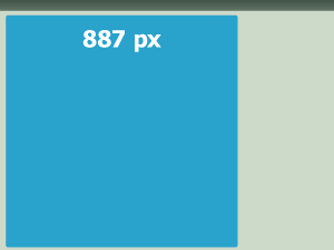
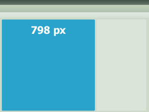
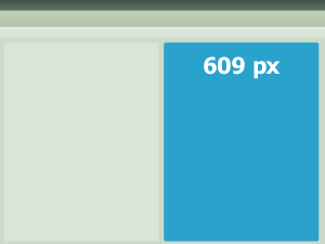
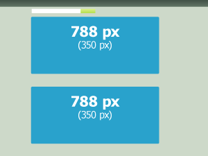
[Examples of journals in different parts of dA with a browser width of 1280px*]
What does this mean for a Journal Skin Design?
If you are about to design and code a fixed journal skin, you should usually start with a worst case scenario
 (Wink)") In this case it means most likely the journal will be viewed on browsers with 1280px width (1024px and smaller has luckily become rare).
In this case it means most likely the journal will be viewed on browsers with 1280px width (1024px and smaller has luckily become rare). This means that the smallest width in which the journal will be viewed is around 600px.
For a layout with fixed width this means that it should not be wider than 600px:
.gr-box {width: 600px;
}
Using width: 600px; on the whole journal aka .gr-box also means, that the journal will always be this wide, no matter how wide the browser is. For wide browsers (~1400 px) there will then be a lot of space on either or both sides of the journal. For smaller browsers there is a chance that contents of the journal will get cut off and won't be visible for the viewer.
There is no way to set a horizontal scrollbar (on dA at the moment) to prepare for the case of smaller resolutions, so it is best to make a fixed width as small as possible.
 Learn how to center your journal! Check out CSS Tricks: Limiting .text width.
You already code responsive, if you DON'T use fixed numbers for widths and height of elements.
Which, from experience, is the case with most journal skins on dA. Most skin suppliers change colors and fonts of elements only and don't touch the size of elements.
BUT the problem with many of those skins is actually that there is no editing of element's sizes. This is especially a danger when someone on a big monitor views a journal styled with such a skin. As I mentioned before not limiting elements can cause serious damage to the readability of a journal.
How responsive should you code?
Do you want to keep everything totally fluid? Then you should work with % in your design. Give the journal text a width: 50%; and it will always be half as wide as the journal. This can lead to issues regarding readability on very wide screens. As soon as there are more than 100 characters in one line, the reader will have issues following the text.
This is why working with a maximun width will work much better for most designs. Add padding and margin to keep it centered and at an even distance to surrounding elements.
I prefer limits to widths over a completely percentage driven layout. It gives me a bit of control like with fixed width journals, while keeping the layout responsive and readable.
This is an example of how to limit the width of the .text element within the journal element (.gr-box).
The journal has a general padding of 20px to give the containing elements room to breath. The text will be limited to be no wider than 400px and become less wide if the journal becomes itself narrower. The text will gain height, to make up for the missing width, but all elements will stay visible.
.gr-box {padding: 20px;
}
.text {margin: auto;
max-width: 400px;
background: #664d80;
color: #ffffff;
padding: 20px;
}
Lorem ipsum dolor sit amet, consetetur sadipscing elitr, sed diam nonumy eirmod tempor invidunt ut labore et dolore magna aliquyam erat, sed diam voluptua. At vero eos et accusam et
Fixed vs. Responsive Overview
Fixed Layout:
- Total control
- Images can be used exactly as in the design
- Complex designs are easier to code
- Chance of contents being cut off
- Limited to ~600px width
- Scroll bars may be required or appear and disturb the design
Responsive Layout:
- No content gets lost
- Simple designs are easy to code
- No unwanted empty space around the journal
- Requires width limits to maintain readability on big screens
- Some images need to prepared for big screens: use patterns, seemlessly repeatable images or very big images that take up server space
What it comes down to
The way you code a journal skin is totally up to you! But please keep in mind the purpose of a journal: if it is meant for text journals that ought to be read, keep them readable! For such skins it might be best to limit text and journal widths.
For a different purpose, different things may be paid attention to. But most people on dA write a journal to talk about something. Make it a pleasure to read what other deviants write!
So now all that's left to say is…
Happy coding! 
*You may have noticed that in one of the examples I added a second number (350 px). This is an important height for the journal portal. Of each journal 350px can be seen when browsing the journals portal. That is why it makes sense to have a at least the headline of the journal to be visible within the first 350px height of your design.
Have a suggestion?
Let me know in a comment or a note. I'd love to hear what you want to know and learn. With your input and suggestions this series can continue and grow.


 This first trick is very simple in execution, but I want to spend some time explaining why you should do it. That's why this journal has become a bit long