ShopDreamUp AI ArtDreamUp
Deviation Actions


Description
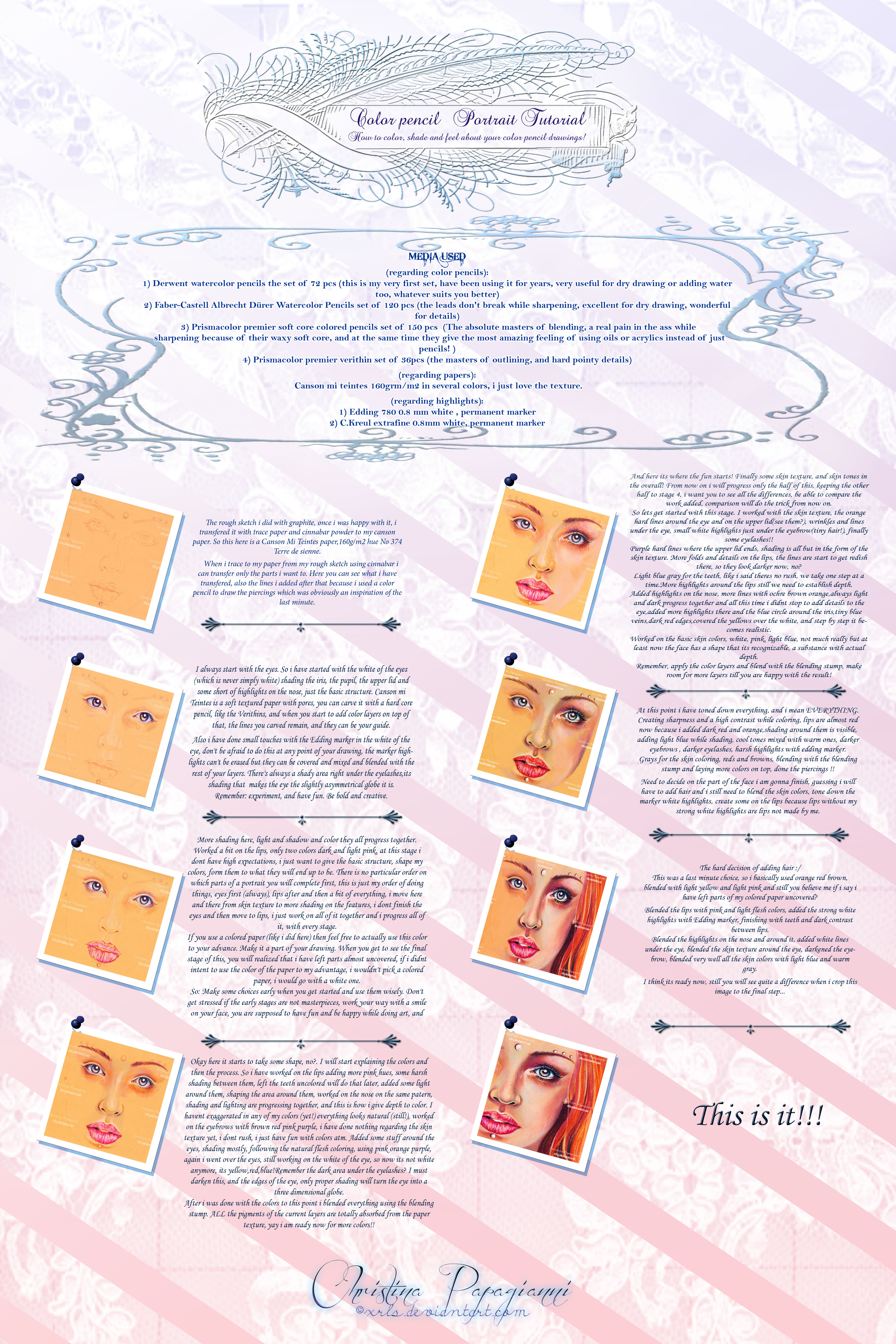
This is the color pencil tutorial i promised to you.There is a huge amount of information that goes along with it, I couldn't possibly fit it in the actual submission so i will simply display it in the description.
MATERIALS I USE


Derwent watercolor pencils set of 72 pcs
Faber-Castell Albrecht Dürer Watercolor Pencils set of 120 pcs
Prismacolor premier soft core colored pencils set of 150 pcs
Prismacolor premier verithin set of 36pcs
Canson mi teintes 160grm/m2
Winsor & Newton Extra Smooth Bristol paper 250grm/m2
Arches watercolor paper 140lb cold press
Winsor and Newton watercolor paper 140lb cold press
Also for dry drawing i occasionally use cheap no name watercolor paper medium tooth160grm/m2, its excellent for sketching and at the same time its weight can hold details of sketches that proceed to projects eventually.
Edding 780 0.8 mm white
C.Kreul extrafine 0.8mm white
White gel pen but i am not that happy with it, it cant adjust effectively and mix over the countless color layers i have done with pencils in prior.
Closing the list of the materials i use i will honestly admit: What you use DOESN'T matter. HOW you use it, does!
HOW TO GET STARTED-COLORING AND SHADING
Obviously i will focus to my favorite style which is realism. If this is what you want to do then you will need a couple of things.
First you need a ref photo which is preferably a high resolution one. It will be impossible to render the extreme amount of details you will need to fit in your piece, if you don't have a proper ref photo. Also the ref photo, besides the high resolution will need to have an artistic value as in the aspect it transmits an emotional impact and a message, because i don't think you would want to end with a rendering of a ref picture that has 'nothing to say' therefor its flat and empty.
I keep my ref pictures in a folder in my comp, the one i am using with my piece i often zoom as much as i wish, and this is how i work, by looking at my screen and portraying everything i see, the way it fits me.
If for some reason its impossible for you to have a high res ref photo (like when you are provided with a poor ref during a commission), know that you will have to fill the gaps by yourself and thats a great deal of extra labor for you. But then again...nothing is easy, right?
Now how to transfer the ref photo on your paper? There are many methods, i believe they are all good as long as they serve their purpose and you end up with a decent basic sketching on your paper. Usually when it comes to portraits i go free hand. Understand that this doesn't make me 'unique' or 'professional' , since repetition and practice are essential for perfection. When you reach the point to have completed 500 portraits (thats a random number) then you ll be well aware where exactly to put a nose.
You can also grid (some times i do too), which is a respected way of transferring your image, or any other method, i would say that practicing free hand will be good for you in any case.
When i am about to start a color pencil drawing i don't use graphite to sketch. It smudges and then it blends with my colors and i don't like that at all. So i use either a color pencil or a watercolor pencil (dry, no watter added) or i use cinnabar to sketch. Using cinnabar to sketch has become a habit of mine after years of practicing Byzantine art. And this is a habit i cant change..
In case you wonder if you have succeeded and you did your ref justice regarding the proportions, theres a nice little trick to examine this before its too late. I have found so far two possible ways to do so. I scan my basic sketching and then i view it reversed.
If you cant scan it then you can as well put it in front of a mirror, the scanner and the mirror are never mistaken, they will always show where you are wrong.
So hypothetically you have your basic art line on your paper one way or the other. Where and how to start with your colors? I see no rules to that honestly. Others start with the eyes (I know this is what i do, i love to start with the eyes, it gives substance to my image) or the skin texture or anything else you think it suits you better. Whatever you choose to start with do it subtlety. Use fine layers, use a blending stump, erase if you must, and burnish might also be a great idea. I do all the above.
Its obvious that the light areas in your drawings you will want to keep them almost untouched. Be very careful there, use very fine color layers, light colors which you will gradually darken to the degree you wish so you make your drawing appears in three dimensions instead of just two.
Keep a file in your comp with your wips of your current project. This way you can always examine the progress of your work.
Know that you are entitled to bring changes in your refs, in a way that the end result will bring your personal touch, your personal 'signature', you can make it yours as in the aspect that your piece will be (and show this way) a part of you as the artist you are.
Making minor (or major) changes to colors, expanding the pallet or diminishing it even, will be your choice. I always do that, its not something i do on purpose, i just let my eyes scan my ref the way they wish to do, and then i let my hands carry on.
Almost always i know how things are going to turn, the finishing product is somehow 'imprinted' inside my head, even when i face a blank piece of paper when a project just starts, i don't see a blank piece of paper there, i see a finished amazing image, with every stroke, with every detail, with absolute clarity and sharpness. I know what will follow, because i see it crystal clear inside my head with all its glory, it just saddens me the fact that my skills are not solid enough to touch MY version of perfection, because the images inside my head are always so bright, so vivid, so strong, they hammer my skull so hard to let them out, and some times i fail myself because what i end up with isn't even as half as good as the images i dream off...
Regarding your questions on how to do eyes, lips, hair, skin texture:
Like i already mentioned try to start with the lighter colors, only to proceed to darker ones so to give a sense of depth to your image.
Use the blending stump regularly! I know its a time consuming process but trust me it worths the effort. The blending stump will push the pigments of the color layers deeper through the paper texture so you can use new layers on top of them making the necessary changes.
Colors are very important, but guess what? Details are very important too. Thats why i suggested earlier you have a high res ref pic to work with. In order to draw a realistic portrait, you must fit as many details as possible in it. But to draw them is one thing. To actually see them is another. If you cant see all the details you need to render, then you must train yourself to do so. All the wrinkles, pores,facial hair,tiny lines, the sum of them will define the skin texture.
SEE the details, and transfer them on your paper.
**A nice trick with realism is to go big. Seriously, the bigger your paper (or canvas) the more details you ll be able to fit in effortless**
Same goes with the eyes and lips. Don't be afraid to use the colors you wont see usually, but you know they are there, they do exist and you have to dig them out. The skin color isn't always soft pink, orange or yellow, it is also purple, green and blue, when you need to shape the darker areas.
I would suggest to practice using a mirror. As i have said this before, go ahead and use your own face as an always available and familiar reference image. Examine the skin texture with a magnifying glass, or even use a magnifying mirror to look at. See whats there, all these little miracles that happen there and practice on them. I don't say you will become experts overnight but practice and repetition are the only way to reach perfection. The day i stop practice will be the day i die. Never stop, never give up. Always try to reach higher , to be better. Trust me, the artists you admire so much and you idolize didn't reach there because they were given some kind of 'gift', they work hard and hard work always pays back.
Yes there IS the significance of 'talent'. Each one of us might have a different definition for it, i personally believe that talent is the original initiative of our genes.But what is this good for if we don't strive to improve it over time??
Know that time is your friend. Also, it is your biggest enemy.
It is your friend because improvement takes time. Perfection takes time. Practice takes time. And while you become older (and wiser hopefully) you will see that your perspectives and priorities concerning art will change. Things you didn't ever consider as possible for your art to happen when you were 16, will happen automatically when you become 30. Years of experience and practice will pile up to give your art substance.
So don't rush. Be patient. Progress doesn't come with the same electiveness to all of us.
Time is your enemy because sooner or later we all run out of it. Our days are counted, do the best you can while you have the chance to do so. And i will say it again just in case you didn't notice the first time:
NEVER stop. NEVER give up.
HOW TO FEEL ABOUT YOUR ART
And now comes the hard part. So to try and make this as easy as possible, i ll make it short.
Try to keep two things in the back of your head.
A) As we grow from kids to teens and then to adults we gain some things and we also lose some. I would strongly advice you would try to gain everything while aging, but lose NONE of the assets you had as kids. So now lets see what a kid has in advance compared to an adult. Lots of energy (little to add here, just do the best you can^^ ) and lots of fun (that you must fight with everything you got in order NOT to lose it, fun makes things bearable in every way, fun will keep you in the frolicsome mood you need to be, so to create vivid art). Don't take yourselves too seriously, keep a fresh eye and a light heart, be gentle and creative and don't forget to smile. A LOT.
B) You might find yourselves at times, surrounded by people declaring how much they care for you, BUT they don't believe you are good enough to meddle with art, therefor you will never be artists. These people are entitled to 'know better' and they will ruin most of your efforts when you try to make yourselves better artists.They will do so in the name of 'love' and 'care' and 'concern' . Avoid them like the plague they are, don't allow to anyone to make YOUR decisions. Carve your own path in this life because you have the right to do so. If you love art with everything you got, you will make it a part of your life, a necessary inseparable one!
Finally we reached to the end of it, i definitely need to give credits to Nadia she was the one to assemble this in photoshop for me since i know nothing of photoshop, she dedicated many hours to create the background, choose the brushes and the letters, she is always there for me thus she deserves my love and friendship.
If you have any kind of questions, feel free to share them.If you wish to redraw some parts of it and practice feel free to do so and when you do please share with a link here so we can together check it out.
I apologize for the size of it in overall, making a tutorial wouldn't cross my mind because i don't consider myself as an expert, but you asked me to share the love and the knowledge and this is what i did.

 all
all  for reading!
MATERIALS I USE
Derwent watercolor pencils set of 72 pcs
Faber-Castell Albrecht Dürer Watercolor Pencils set of 120 pcs
Prismacolor premier soft core colored pencils set of 150 pcs
Prismacolor premier verithin set of 36pcs
Canson mi teintes 160grm/m2
Winsor & Newton Extra Smooth Bristol paper 250grm/m2
Arches watercolor paper 140lb cold press
Winsor and Newton watercolor paper 140lb cold press
Also for dry drawing i occasionally use cheap no name watercolor paper medium tooth160grm/m2, its excellent for sketching and at the same time its weight can hold details of sketches that proceed to projects eventually.
Edding 780 0.8 mm white
C.Kreul extrafine 0.8mm white
White gel pen but i am not that happy with it, it cant adjust effectively and mix over the countless color layers i have done with pencils in prior.
Closing the list of the materials i use i will honestly admit: What you use DOESN'T matter. HOW you use it, does!
HOW TO GET STARTED-COLORING AND SHADING
Obviously i will focus to my favorite style which is realism. If this is what you want to do then you will need a couple of things.
First you need a ref photo which is preferably a high resolution one. It will be impossible to render the extreme amount of details you will need to fit in your piece, if you don't have a proper ref photo. Also the ref photo, besides the high resolution will need to have an artistic value as in the aspect it transmits an emotional impact and a message, because i don't think you would want to end with a rendering of a ref picture that has 'nothing to say' therefor its flat and empty.
I keep my ref pictures in a folder in my comp, the one i am using with my piece i often zoom as much as i wish, and this is how i work, by looking at my screen and portraying everything i see, the way it fits me.
If for some reason its impossible for you to have a high res ref photo (like when you are provided with a poor ref during a commission), know that you will have to fill the gaps by yourself and thats a great deal of extra labor for you. But then again...nothing is easy, right?
Now how to transfer the ref photo on your paper? There are many methods, i believe they are all good as long as they serve their purpose and you end up with a decent basic sketching on your paper. Usually when it comes to portraits i go free hand. Understand that this doesn't make me 'unique' or 'professional' , since repetition and practice are essential for perfection. When you reach the point to have completed 500 portraits (thats a random number) then you ll be well aware where exactly to put a nose.
You can also grid (some times i do too), which is a respected way of transferring your image, or any other method, i would say that practicing free hand will be good for you in any case.
When i am about to start a color pencil drawing i don't use graphite to sketch. It smudges and then it blends with my colors and i don't like that at all. So i use either a color pencil or a watercolor pencil (dry, no watter added) or i use cinnabar to sketch. Using cinnabar to sketch has become a habit of mine after years of practicing Byzantine art. And this is a habit i cant change..
In case you wonder if you have succeeded and you did your ref justice regarding the proportions, theres a nice little trick to examine this before its too late. I have found so far two possible ways to do so. I scan my basic sketching and then i view it reversed.
If you cant scan it then you can as well put it in front of a mirror, the scanner and the mirror are never mistaken, they will always show where you are wrong.
So hypothetically you have your basic art line on your paper one way or the other. Where and how to start with your colors? I see no rules to that honestly. Others start with the eyes (I know this is what i do, i love to start with the eyes, it gives substance to my image) or the skin texture or anything else you think it suits you better. Whatever you choose to start with do it subtlety. Use fine layers, use a blending stump, erase if you must, and burnish might also be a great idea. I do all the above.
Its obvious that the light areas in your drawings you will want to keep them almost untouched. Be very careful there, use very fine color layers, light colors which you will gradually darken to the degree you wish so you make your drawing appears in three dimensions instead of just two.
Keep a file in your comp with your wips of your current project. This way you can always examine the progress of your work.
Know that you are entitled to bring changes in your refs, in a way that the end result will bring your personal touch, your personal 'signature', you can make it yours as in the aspect that your piece will be (and show this way) a part of you as the artist you are.
Making minor (or major) changes to colors, expanding the pallet or diminishing it even, will be your choice. I always do that, its not something i do on purpose, i just let my eyes scan my ref the way they wish to do, and then i let my hands carry on.
Almost always i know how things are going to turn, the finishing product is somehow 'imprinted' inside my head, even when i face a blank piece of paper when a project just starts, i don't see a blank piece of paper there, i see a finished amazing image, with every stroke, with every detail, with absolute clarity and sharpness. I know what will follow, because i see it crystal clear inside my head with all its glory, it just saddens me the fact that my skills are not solid enough to touch MY version of perfection, because the images inside my head are always so bright, so vivid, so strong, they hammer my skull so hard to let them out, and some times i fail myself because what i end up with isn't even as half as good as the images i dream off...
Regarding your questions on how to do eyes, lips, hair, skin texture:
Like i already mentioned try to start with the lighter colors, only to proceed to darker ones so to give a sense of depth to your image.
Use the blending stump regularly! I know its a time consuming process but trust me it worths the effort. The blending stump will push the pigments of the color layers deeper through the paper texture so you can use new layers on top of them making the necessary changes.
Colors are very important, but guess what? Details are very important too. Thats why i suggested earlier you have a high res ref pic to work with. In order to draw a realistic portrait, you must fit as many details as possible in it. But to draw them is one thing. To actually see them is another. If you cant see all the details you need to render, then you must train yourself to do so. All the wrinkles, pores,facial hair,tiny lines, the sum of them will define the skin texture.
SEE the details, and transfer them on your paper.
**A nice trick with realism is to go big. Seriously, the bigger your paper (or canvas) the more details you ll be able to fit in effortless**
Same goes with the eyes and lips. Don't be afraid to use the colors you wont see usually, but you know they are there, they do exist and you have to dig them out. The skin color isn't always soft pink, orange or yellow, it is also purple, green and blue, when you need to shape the darker areas.
I would suggest to practice using a mirror. As i have said this before, go ahead and use your own face as an always available and familiar reference image. Examine the skin texture with a magnifying glass, or even use a magnifying mirror to look at. See whats there, all these little miracles that happen there and practice on them. I don't say you will become experts overnight but practice and repetition are the only way to reach perfection. The day i stop practice will be the day i die. Never stop, never give up. Always try to reach higher , to be better. Trust me, the artists you admire so much and you idolize didn't reach there because they were given some kind of 'gift', they work hard and hard work always pays back.
Yes there IS the significance of 'talent'. Each one of us might have a different definition for it, i personally believe that talent is the original initiative of our genes.But what is this good for if we don't strive to improve it over time??
Know that time is your friend. Also, it is your biggest enemy.
It is your friend because improvement takes time. Perfection takes time. Practice takes time. And while you become older (and wiser hopefully) you will see that your perspectives and priorities concerning art will change. Things you didn't ever consider as possible for your art to happen when you were 16, will happen automatically when you become 30. Years of experience and practice will pile up to give your art substance.
So don't rush. Be patient. Progress doesn't come with the same electiveness to all of us.
Time is your enemy because sooner or later we all run out of it. Our days are counted, do the best you can while you have the chance to do so. And i will say it again just in case you didn't notice the first time:
NEVER stop. NEVER give up.
HOW TO FEEL ABOUT YOUR ART
And now comes the hard part. So to try and make this as easy as possible, i ll make it short.
Try to keep two things in the back of your head.
A) As we grow from kids to teens and then to adults we gain some things and we also lose some. I would strongly advice you would try to gain everything while aging, but lose NONE of the assets you had as kids. So now lets see what a kid has in advance compared to an adult. Lots of energy (little to add here, just do the best you can^^ ) and lots of fun (that you must fight with everything you got in order NOT to lose it, fun makes things bearable in every way, fun will keep you in the frolicsome mood you need to be, so to create vivid art). Don't take yourselves too seriously, keep a fresh eye and a light heart, be gentle and creative and don't forget to smile. A LOT.
B) You might find yourselves at times, surrounded by people declaring how much they care for you, BUT they don't believe you are good enough to meddle with art, therefor you will never be artists. These people are entitled to 'know better' and they will ruin most of your efforts when you try to make yourselves better artists.They will do so in the name of 'love' and 'care' and 'concern' . Avoid them like the plague they are, don't allow to anyone to make YOUR decisions. Carve your own path in this life because you have the right to do so. If you love art with everything you got, you will make it a part of your life, a necessary inseparable one!
Finally we reached to the end of it, i definitely need to give credits to Nadia
she was the one to assemble this in photoshop for me since i know nothing of photoshop, she dedicated many hours to create the background, choose the brushes and the letters, she is always there for me thus she deserves my love and friendship.If you have any kind of questions, feel free to share them.If you wish to redraw some parts of it and practice feel free to do so and when you do please share with a link here so we can together check it out.
I apologize for the size of it in overall, making a tutorial wouldn't cross my mind because i don't consider myself as an expert, but you asked me to share the love and the knowledge and this is what i did.
all for reading!Image size
4000x6000px 3.48 MB
© 2013 - 2024 XRlS
Comments140
Join the community to add your comment. Already a deviant? Log In
Excellent and useful information, Christina. You've written a book here. Thank you so much for your generosity in sharing your techniques for our improvement.