www.lkazphoto.com/Articles
"City Life is a glimpse into what one might experience had one been living in this place (whereas Street is a glimpse into the existence of moment that no longer exists)" I really like this definition of yours.
Actually what I've noticed from analyzing your shots, is that even when they are quite “street", you are able to make a moment eternal, like in a Hopper painting, because you don’t freeze a moment, but a feeling.
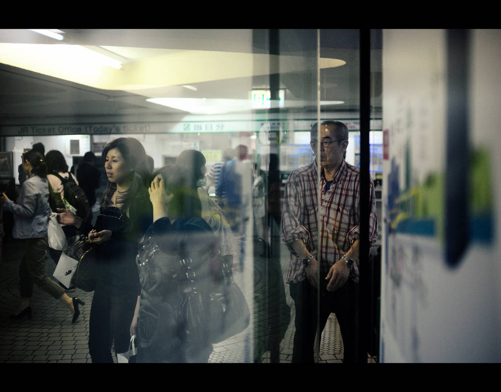
The first time I saw this shot of yours (which is actually a self-portrait)
it reminded me of Leiter, a photographer that I loved very much. Yes, I think that, in a way, you seek beauty and unlike Hopper you don't depict an unhappy world, but a world where every individual is actively playing their role, not alienated. A sort of "positive hyperrealism".
1- The first question is: why do you prefer color to express yourself?
1. The answer lies above: realism. I may be unimaginative, but I find that color helps me represent the world as I see it. I’m a very literal thinker. I enjoy reading about subjects like physics and economics in order to better understand the universe. When I look around me, I see lots of color. Everything is colorful. To me, it would be a shame to ignore this dimension of reality for the sake of my own expression. I choose to include color in a form that is as unadulterated as I can make it.You’ll also find that in my old photos I play with the color, changing white balance, etc. But in my more recent work, I always edit as close to reality as possible. I try to show the scene exactly as I remember it being when I stood there taking the photo. Of course, this is plenty subjective, but the goal is a kind of objective reality in the photograph.
2- Your technical articles are really interesting, but you never talk of the choices you make about color or black and white, why?
2. Well, now that you mention it, I think I might write one soon! I do feel that black and white photography removes a significant portion of the information present within a scene, that is, the color information. This allows us to focus in on more nuanced details. There are times when I will edit to black and white because I feel it simply works better given the circumstances. Essentially, sometimes colors can be distracting and take away from the emotional content or geometrical impact of a scene. However, given what I’ve said above about realism and respect for ‘objective’ reality, I find that eliminating the colors because they simply ‘don’t work’ means I didn’t do my job. Hence, I tend to prefer color. It’s simply how I see the world.
3- I guess you are obviously influenced by the color and light of your city. Try to imagine yourself in a European one, how do you think you would use color then?
3. Someone once told me: all places are colorful, only the palette changes. During the time I've spent in Europe I've seen more grays and browns present around the city, punctuated by some bright splashes of color here and there. But I don't think this would change my daytime shooting too much. The nighttime, on the other hand, would be quite different. Regarding night photography, I am at a great advantage in Tokyo in that the city is often lit by halogen, xenon, and other bright nearly white light sources. This is opposed to the sodium vapor lamps often present in Europe (in my past experience), which cast an orange tinge on the streets. This would require a reworking of my night photography strategy.
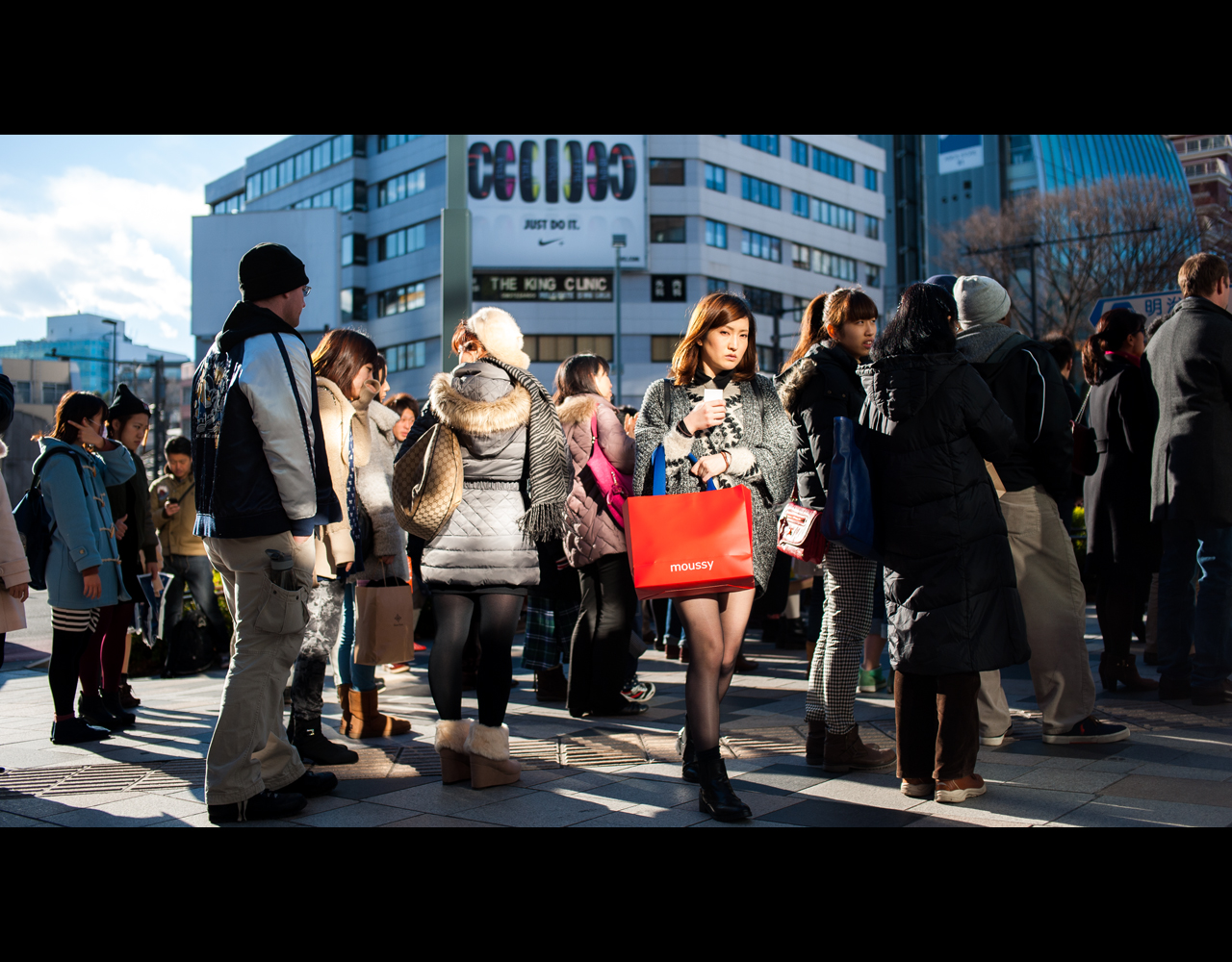
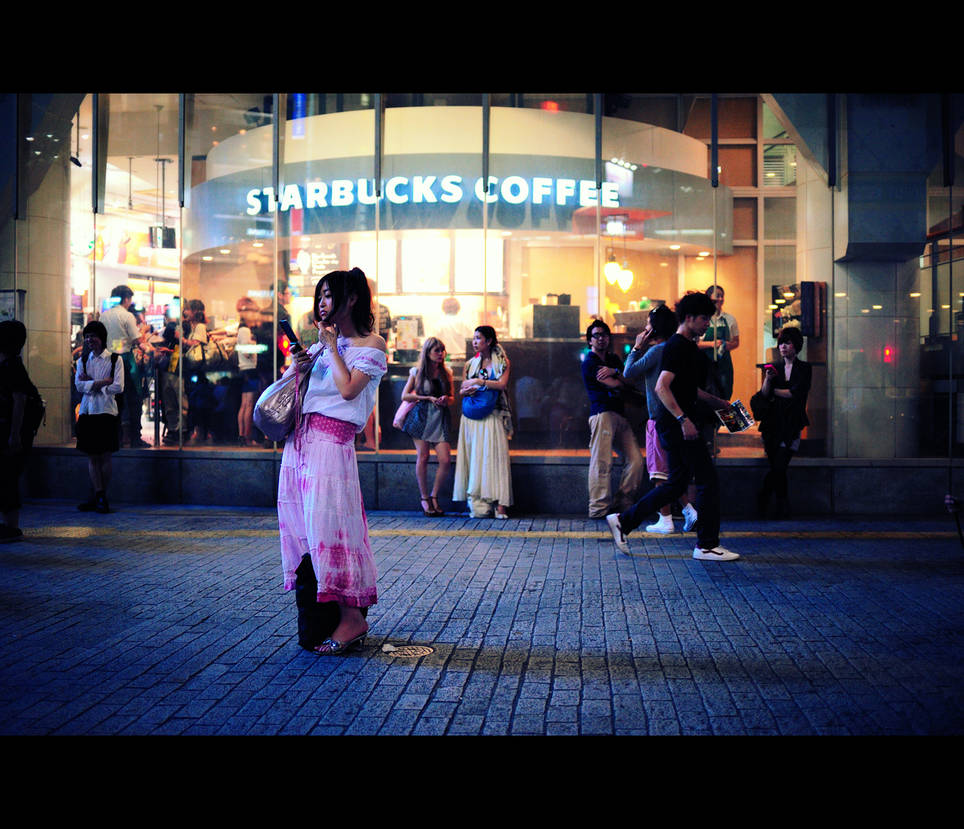
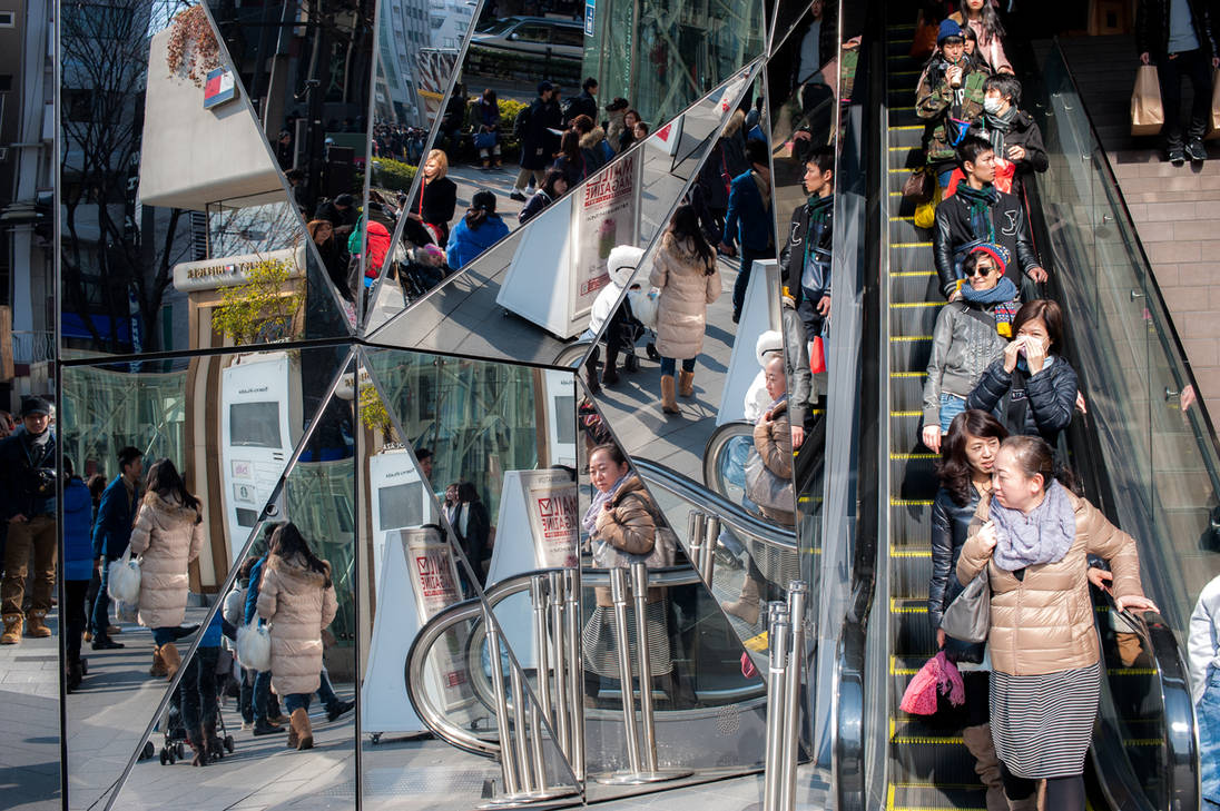
4- You often pick a person in the moving crowd and catch it. I've read that you prefer manual focus, and the results are great, but what is the secret behind a photograph like this one?

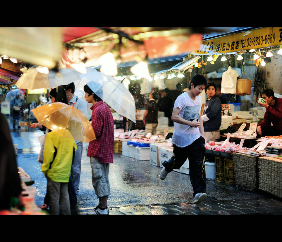
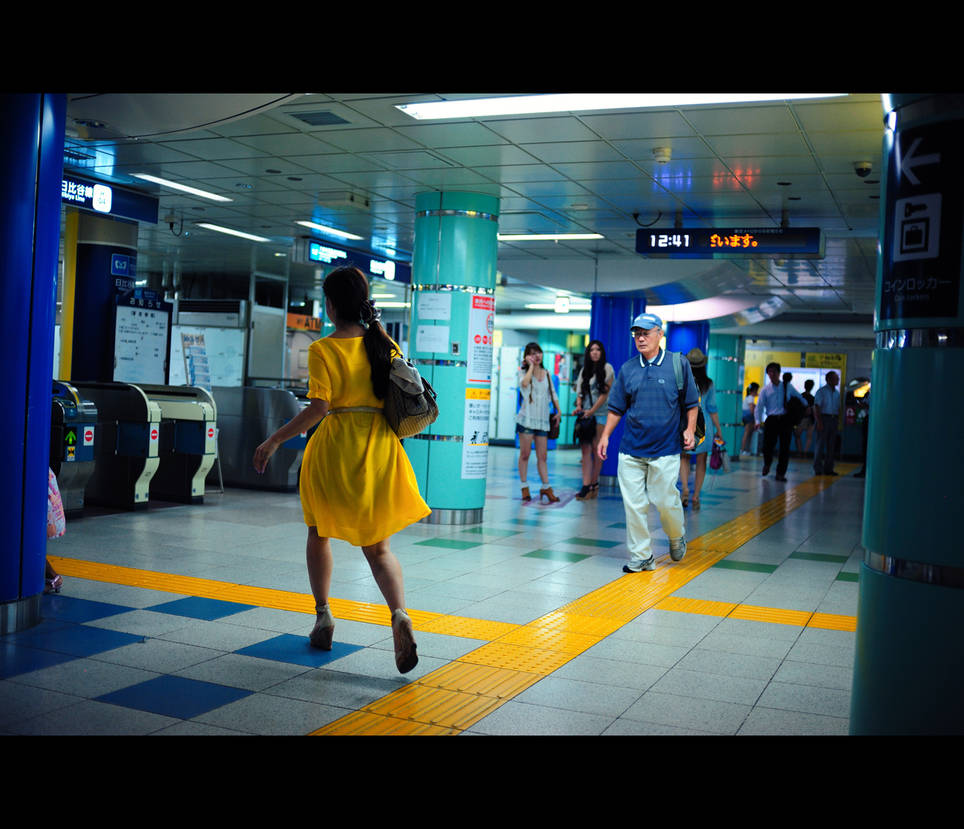
4. Yes, I love crowds. In the beginning I was annoyed by them because I wanted to isolate subjects in the frame. However, in Tokyo crowds are ubiquitous, so I had to learn to go with the flow and isolate subjects another way. The crowd itself becomes a space in which the subject can be isolated. In the case of this photo, I pre-focused on a certain distance, crouched down and glued my eye to the viewfinder. I then waited until a good opportunity presented itself. I'm sure I took a few other frames in this series before this lady presented an emotion that could carry the photo. At times like this I imagine myself as a wildlife photographer patiently waiting for an interesting behavior. As to how it would look in B/W, I'd say the main character would stand out a bit less since her bright shopping bag would no longer draw in the eye.The other strategy is to pre-focus and then shoot from the hip. This works well when I'm moving through a crowd and can result in photos such as this one:

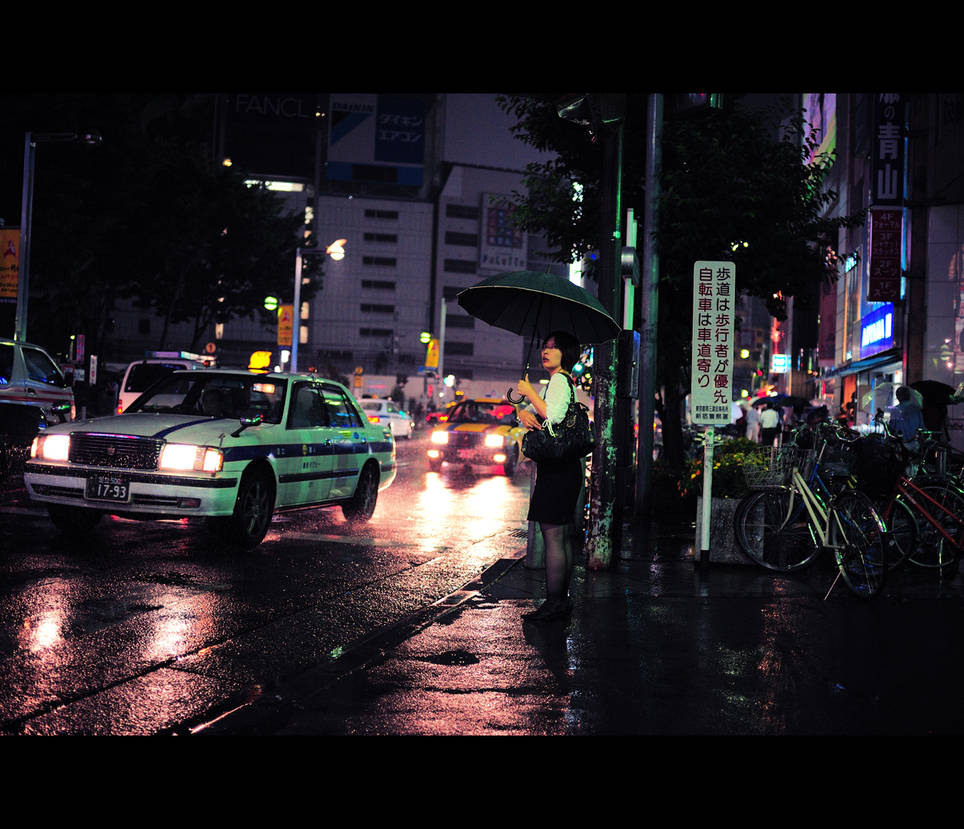
5- there is a strong predominance of night shots, you believe that artificial light is conducive to what you want to express?
5. There is something very alluring about the night in Tokyo. From a technical standpoint, the light is easy to work with: lots of bright, white lights, but also some colored lighting peppered around for added hues. In addition, lots of people are out at night in the busy areas. This means lots of stories are unfolding ready to be photographed. In addition, I'm largely inspired by the cyberpunk genre. The stories seem to take place in perpetual night cities: films like Blade Runner and Ghost in the Shell, bookssuch as Neuromancer or games like Deus Ex. Tokyo being the inspiration for these cyberpunk stories it goes full circle, and so I shoot at night. Plus I'm not really a morning person.
and now here are the same questions I've asked Khuram and Alphan:
6- Do you agree with this statement?
“When you photograph people in color, you photograph their clothes. But when you photograph people in Black and white, you photograph their souls!” – Ted Grant
6. I think the likes of Steve McCurry, David Gibson, and even recently Bruce Gilden, as well as others, would disagree. I think Grant is writing in a time when color photography was a nascent technology; much like digital photography was 15 to 20 years ago. Before that, surely the compact camera shooters were derided by the professionals shooting on large format cameras. There is always a resistance to new things and I believe that’s where this quote comes from.
However, to answer it more directly, I feel that the soul of a photograph lies in the moment, not it’s color palette.
7- Someone thinks that through certain colors we communicate certain emotions. when you shot do you think of this?
I noticed a prevalence of blue in your images...
7. I don't think I consciously perceive the emotions that colors bring out in my photos. I do however pay close attention to the harmony of colors. I love to get nice contrast, such as blue and yellow, or red and black. The prevalence of blue, especially in my older photos, is due to creative white balance. I had a penchant for selecting the 'wrong' white balance in order to get an effect. Recently, however, I always process my photos for a natural look: I strive to recreate reality. In short, I use color to contrast subjectsand environments, to the draw the eye to a certain object, or to evooke a general mood. I seldom think of the emotions of the colors though I'm sure there is some subconscious process at play.
Thanks Lukasz, you have been very kind
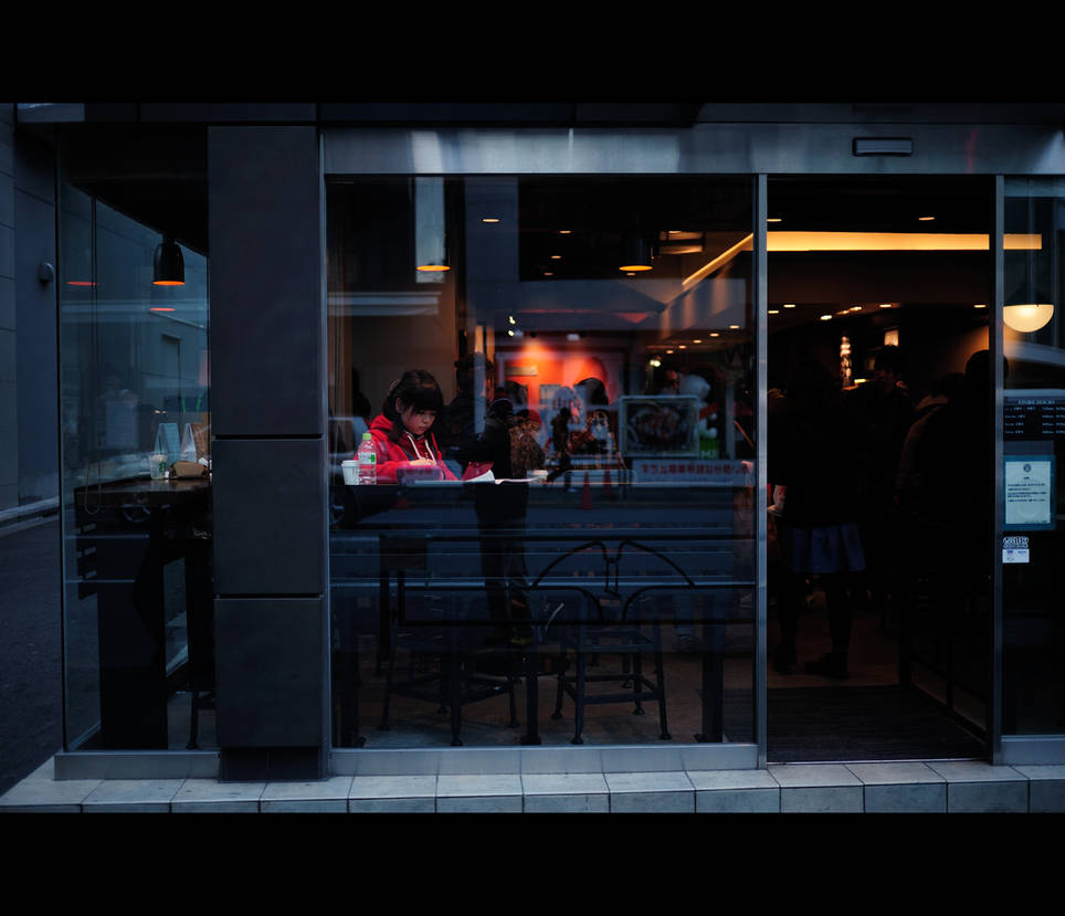
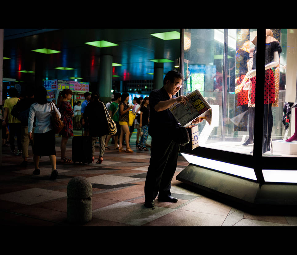
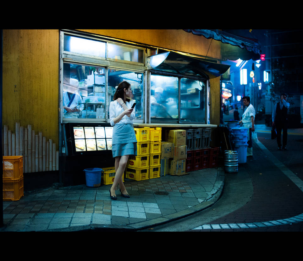
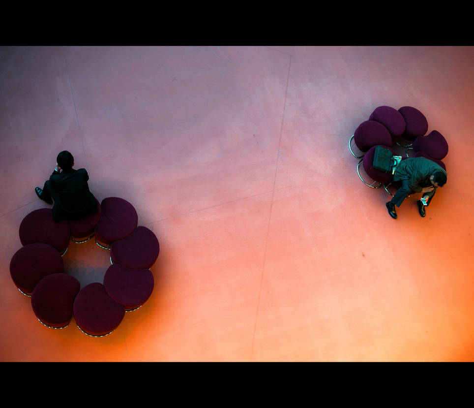
And now enjoy a collection of his beautiful pictures.
This Journal Skin was designed by Night-Beast


