ShopDreamUp AI ArtDreamUp
Deviation Actions


Suggested Deviants


Suggested Collections


![[PC] [ACEO] Kinrano Nox](https://images-wixmp-ed30a86b8c4ca887773594c2.wixmp.com/f/48b806e2-48d4-4d45-8ebd-d697794753ca/d9w6fwy-7a19bde7-cbaf-47c6-a55b-c51ae062eadf.png/v1/crop/w_184,h_184,x_9,y_0,scl_0.10672853828306/_pc___aceo__kinrano_nox_by_sirelizabeth_d9w6fwy-92s-2x.png?token=eyJ0eXAiOiJKV1QiLCJhbGciOiJIUzI1NiJ9.eyJzdWIiOiJ1cm46YXBwOjdlMGQxODg5ODIyNjQzNzNhNWYwZDQxNWVhMGQyNmUwIiwiaXNzIjoidXJuOmFwcDo3ZTBkMTg4OTgyMjY0MzczYTVmMGQ0MTVlYTBkMjZlMCIsIm9iaiI6W1t7ImhlaWdodCI6Ijw9ODYxIiwicGF0aCI6IlwvZlwvNDhiODA2ZTItNDhkNC00ZDQ1LThlYmQtZDY5Nzc5NDc1M2NhXC9kOXc2Znd5LTdhMTliZGU3LWNiYWYtNDdjNi1hNTViLWM1MWFlMDYyZWFkZi5wbmciLCJ3aWR0aCI6Ijw9MTAyNCJ9XV0sImF1ZCI6WyJ1cm46c2VydmljZTppbWFnZS5vcGVyYXRpb25zIl19.e5wKGyGqi2VMaqK7_e489tm9Xj7LXPUBWXgh8taocBE)
![[PC] [ACEO] Kinrano Nox](https://images-wixmp-ed30a86b8c4ca887773594c2.wixmp.com/f/48b806e2-48d4-4d45-8ebd-d697794753ca/d9w6fwy-7a19bde7-cbaf-47c6-a55b-c51ae062eadf.png/v1/crop/w_92,h_92,x_4,y_0,scl_0.053364269141531/_pc___aceo__kinrano_nox_by_sirelizabeth_d9w6fwy-92s.png?token=eyJ0eXAiOiJKV1QiLCJhbGciOiJIUzI1NiJ9.eyJzdWIiOiJ1cm46YXBwOjdlMGQxODg5ODIyNjQzNzNhNWYwZDQxNWVhMGQyNmUwIiwiaXNzIjoidXJuOmFwcDo3ZTBkMTg4OTgyMjY0MzczYTVmMGQ0MTVlYTBkMjZlMCIsIm9iaiI6W1t7ImhlaWdodCI6Ijw9ODYxIiwicGF0aCI6IlwvZlwvNDhiODA2ZTItNDhkNC00ZDQ1LThlYmQtZDY5Nzc5NDc1M2NhXC9kOXc2Znd5LTdhMTliZGU3LWNiYWYtNDdjNi1hNTViLWM1MWFlMDYyZWFkZi5wbmciLCJ3aWR0aCI6Ijw9MTAyNCJ9XV0sImF1ZCI6WyJ1cm46c2VydmljZTppbWFnZS5vcGVyYXRpb25zIl19.e5wKGyGqi2VMaqK7_e489tm9Xj7LXPUBWXgh8taocBE)
You Might Like…


![[COMM] Bandersnatcher](https://images-wixmp-ed30a86b8c4ca887773594c2.wixmp.com/f/d9666047-7e12-4ae3-a420-1c039ceae47f/dd1eh95-d1468d92-b8d6-4e50-8c1f-00ced899506c.png/v1/crop/w_184,h_184,x_23,y_0,scl_0.089017900338655,q_70,strp/_comm__bandersnatcher_by_charlie__x_dd1eh95-92s-2x.jpg?token=eyJ0eXAiOiJKV1QiLCJhbGciOiJIUzI1NiJ9.eyJzdWIiOiJ1cm46YXBwOjdlMGQxODg5ODIyNjQzNzNhNWYwZDQxNWVhMGQyNmUwIiwiaXNzIjoidXJuOmFwcDo3ZTBkMTg4OTgyMjY0MzczYTVmMGQ0MTVlYTBkMjZlMCIsIm9iaiI6W1t7ImhlaWdodCI6Ijw9MjA2NyIsInBhdGgiOiJcL2ZcL2Q5NjY2MDQ3LTdlMTItNGFlMy1hNDIwLTFjMDM5Y2VhZTQ3ZlwvZGQxZWg5NS1kMTQ2OGQ5Mi1iOGQ2LTRlNTAtOGMxZi0wMGNlZDg5OTUwNmMucG5nIiwid2lkdGgiOiI8PTMxMDAifV1dLCJhdWQiOlsidXJuOnNlcnZpY2U6aW1hZ2Uub3BlcmF0aW9ucyJdfQ.mLx9YFLTX1IQhsYSqRj4sspEldwHFBWEWQzbOQPVVQA)
![[COMM] Bandersnatcher](https://images-wixmp-ed30a86b8c4ca887773594c2.wixmp.com/f/d9666047-7e12-4ae3-a420-1c039ceae47f/dd1eh95-d1468d92-b8d6-4e50-8c1f-00ced899506c.png/v1/crop/w_92,h_92,x_11,y_0,scl_0.044508950169328,q_70,strp/_comm__bandersnatcher_by_charlie__x_dd1eh95-92s.jpg?token=eyJ0eXAiOiJKV1QiLCJhbGciOiJIUzI1NiJ9.eyJzdWIiOiJ1cm46YXBwOjdlMGQxODg5ODIyNjQzNzNhNWYwZDQxNWVhMGQyNmUwIiwiaXNzIjoidXJuOmFwcDo3ZTBkMTg4OTgyMjY0MzczYTVmMGQ0MTVlYTBkMjZlMCIsIm9iaiI6W1t7ImhlaWdodCI6Ijw9MjA2NyIsInBhdGgiOiJcL2ZcL2Q5NjY2MDQ3LTdlMTItNGFlMy1hNDIwLTFjMDM5Y2VhZTQ3ZlwvZGQxZWg5NS1kMTQ2OGQ5Mi1iOGQ2LTRlNTAtOGMxZi0wMGNlZDg5OTUwNmMucG5nIiwid2lkdGgiOiI8PTMxMDAifV1dLCJhdWQiOlsidXJuOnNlcnZpY2U6aW1hZ2Uub3BlcmF0aW9ucyJdfQ.mLx9YFLTX1IQhsYSqRj4sspEldwHFBWEWQzbOQPVVQA)
Featured in Groups


Description
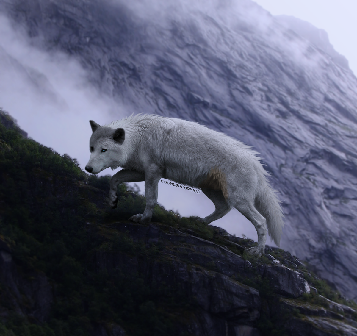
||Jackson
Merry Christmas, endless-adventure! (Surprise!)
This is Jackson, aka Jax, son of Ragnarok and Church. He is a character over on Lunar Children!
Its been a while since I've picked up the pen and tablet and given manipping a try. So this is a little rough but I'm pretty happy with it. I hope to keep working on more pieces and improve upon my results; I am especially happy with the fur over his neck/ruff, and the golden marking on his flank.
This is my entry for OfOneSoul's How DA Stole Christmas: Contest.
When I first heard about this contest I knew right away who I wanted to make something for. Riley, you've been a really great friend to me, and this is my way of saying thank you! You've always got an open ear if I need someone to talk to, and our mini-rant sessions always make me laugh and brighten my day. I don't think you realize how much you encourage me to try to be better - a better writer, a better artist, and a better person. Each of those facets of your own life inspire me, you are so incredibly talented and kind! When you mentioned the possibility of adopting out Jax, and how much it disappointed you because of the plans you had for him, I knew he had to be the subject of this manip. I really hope you like it.
Stock:
Wolf Body - ZD 23
Wolf Head - Personal stock
Background - Misty cliff


Image size
1200x1129px 1.42 MB
© 2016 - 2024 CastleGraphics
Comments6
Join the community to add your comment. Already a deviant? Log In
First off, this is amazing! You don't give yourself enough credit. Honestly, I can't merge stock images very well and yours is flawless. I didn't even know you did until I peeked at the stock! Another thing that blows my mind is the grounding. You put the wolf in here so well and so naturally, that I am jealous. You cannot tell that this was on a different background, it looks like the original stock photo.
The way that you did the fur, I am really impressed. It looks amazing down the back and on the tail, I really like how you did clumps of fur instead of the usual strand by strand. It gives the image more sense of movement and flow. There are however, two areas that stand out a little to me. The first is the patch just behind the head, right on the scruff. The dark grey lines are a little too hard I think, and make them seem out of sorts a bit. Right after the more forked clump of hair, the second larger one, they look great! It's just before that that I would either soften them up or give them more definition by shading in the fur a touch more. The other area is the belly. The movement and shape you have of the fur is amazing, but it looks like there is some colour or unsmudged fur in behind it. I would just completely erase the softer gray parts if you understand what I am getting at. xD I can send you a screenshot if you like! I can be bad at explaining things. Other than that you added in really good fur details and put mine to shame! Honestly it looks so good.
The way you darkened the background is really nice, it brings the focus right to the character. The lighting is pretty good too! It could be more extreme (more shaded and then BAM light) but not everyone likes dramatic lighting. For normal lighting, it's very well done. From the direction of where I think you put the light source (near the rump, the top right corner?) the face would be a little more shaded as it's not in the direct flow of light. Another thing I notice around the face is that the nose seems to be a bit blurry compared to the rest of the image. Sharpening it up a bit would add some more dynamic I think! The eyes you also did such a good job on, they are bright and in focus. You didn't add the little white eye dots/eye shine but I think it looks okay without them!
Only reason why originality is at three stars is because there are a lot of wolf manips up there, and a lot involve cliffs. xD Nothing against you though! I really, really love this and think that you need to be kinder to yourself. You are a true artist, despite what you say! You just need to keep on it. <3
Okay I THINK I hit all my points here. If you have any questions just let me know!