ShopDreamUp AI ArtDreamUp
Deviation Actions


Description
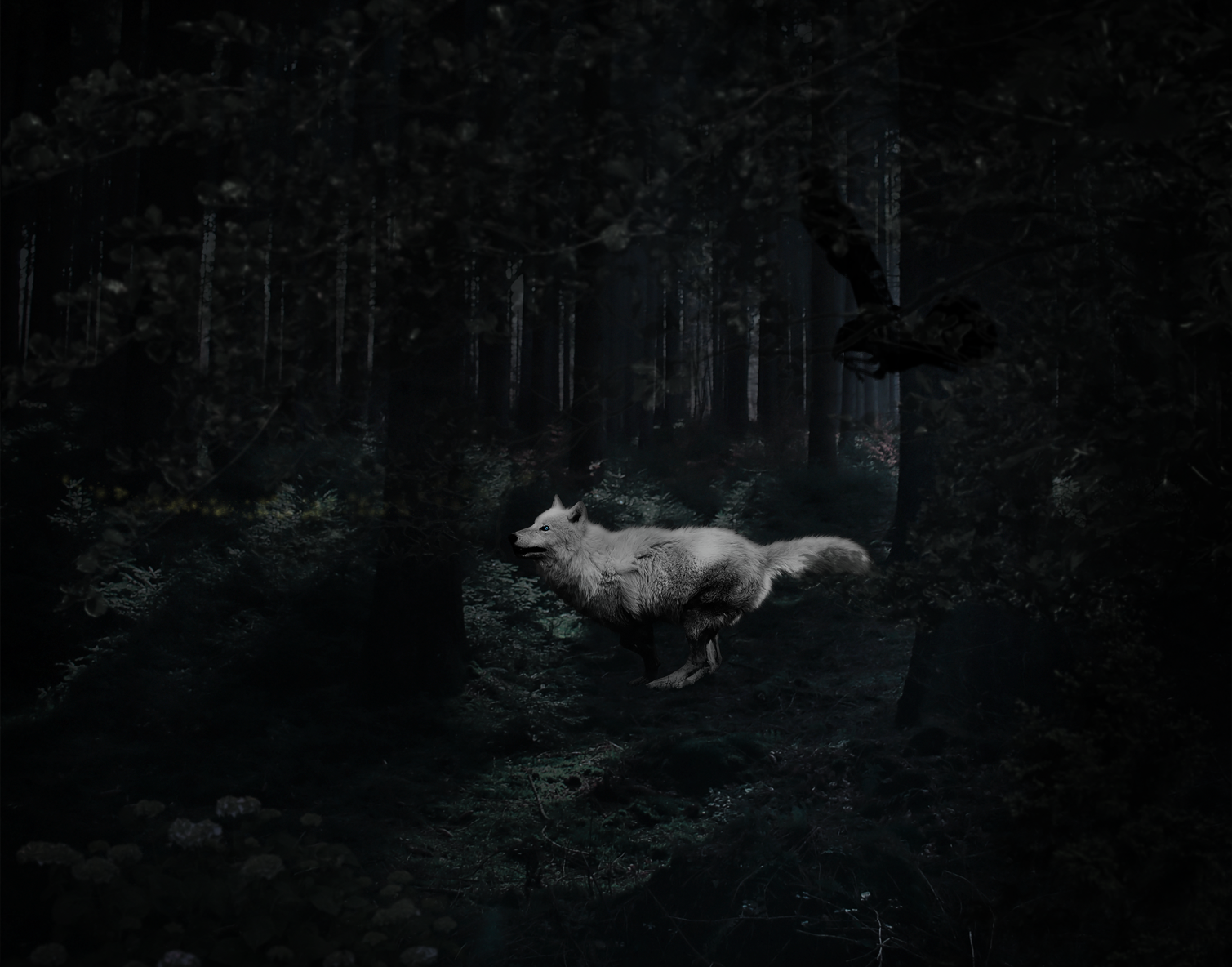
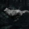
Scene (a little converted) of the stories that I put from time to time on the blog. Here Kamma transformed into a wolf flees into the forest from the vet, because instinct tells her to flee. To run as far away from civilization. But the story is placed in the twenty-first century.
I invite you Cirk Damonia but unfortunately in Polish (you don'y say )
)
Background||Wolf
bush 1||bush 2||tree
Raven is brush I do not know where
I invite you Cirk Damonia but unfortunately in Polish (you don'y say
)Background||Wolf
bush 1||bush 2||tree
Raven is brush I do not know where
Image size
1509x1184px 2.46 MB
© 2016 - 2024 Kamma57
Comments2
Join the community to add your comment. Already a deviant? Log In
Hi! This is a great piece. I particularly like the juxtaposition of the white wolf with the dark forest background. I think it greats a nice sense of contrast that makes the piece very interesting. I did notice that you've submitted this piece into Canipulate for some critique, so I'll do my best to give you a few pointers that will hopefully be of use!
Firstly, you've done a great job of trying to create a sense of depth in the image by creating layers. I love it when artists make use of background, midground, and foreground, as you've done here by adding the additional bushes/branches in the foreground. Doing so makes the whole piece a little more interesting and makes it seem as though we are looking through the branches to witness the scene you've created. I also like the fact that the way you've positioned the branches/bushes seems to "frame" the wolf, drawing the viewer's eye to the center of the artwork, so to speak.
The addition of the raven also adds a lovely sense of motion to the piece, complementing the running wolf. However, the raven seems to get lost in the branches right now, especially because it is very shadowy. I would move the raven forward (perhaps even in front of the wolf) so that it's more apparent. I would also make it a little bigger (to emphasize its position closer to the viewer) and blur it a bit to create the illusion of a lens blur (the focus of the "camera" is on the wolf, so surroundings should be out of focus).
As a little bit of a compositional trick, you could also try to identify the "line of motion" in this piece and place the raven along that line. Draw an imaginary line to show the direction in which the wolf is running, and put the raven somewhere on that imaginary line. In my experience, this will make the whole piece more cohesive.
The lighting on the wolf is also a little different than the lighting in the environment. If you notice the position of the shadows on the trees in the background, you will see that the shadows are all on one side of the trees (this is easier to see on the trees in the back, closer to the light source). If you look at the wolf, it looks like the light is coming more from above. Because the lighting on the wolf and the lighting in the background do not match, it's more obvious that the wolf does not "belong" in the environment. I would try to match the shading/lighting on the wolf to the shading/lighting of the background. Bring the shadows on the wolf higher on her body. You could create a new layer over the wolf layer and set the blending mode to "Multiply." Then take a very soft, fuzzy brush and bring the shadows higher on the wolf's body (up her legs and chest and even a little more on the face), trying to match the way the shadows of the trees are. Then lower the opacity of the layer with the shadows until it looks right.
Lastly, there seems to be a line of faint yellow/gold sparkles or dots toward the front of the image. I'm not sure if it was added on purpose with a brush or if it came from one of the stock images, but it's a little distracting. Because the background is very dark, anything light will show up very strongly, so since you want the focus of the piece to be on the wolf, I would try to remove these dots.
Overall, you've done a great job here. I really enjoyed the movement in this piece. Even though there aren't many colours present, the structure of the image makes for a complex and interesting scene. Hopefully, I was able to give you some useful tips that you can use in the future, and if anything wasn't clear, please let me know!