Decoding Daily Deviations is the series that aims to unlock the secrets of what it took to create these magnificent artworks and motivate others to work towards similar recognition. Each week we will present an interview with one artist who has recently received a DD and have them share the details on that specific piece, relating to their creative process, techniques, and narrative inspirations. If you've ever wanted to know more about a beloved artwork and the talented skills applied to it, this is the series to keep track of!"
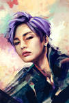
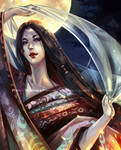
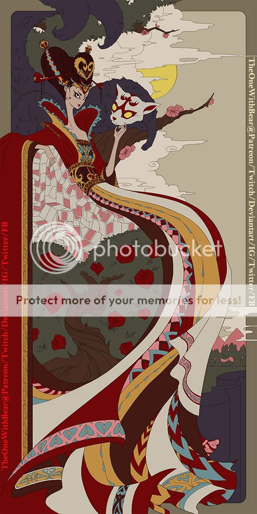
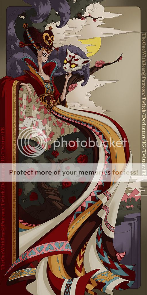
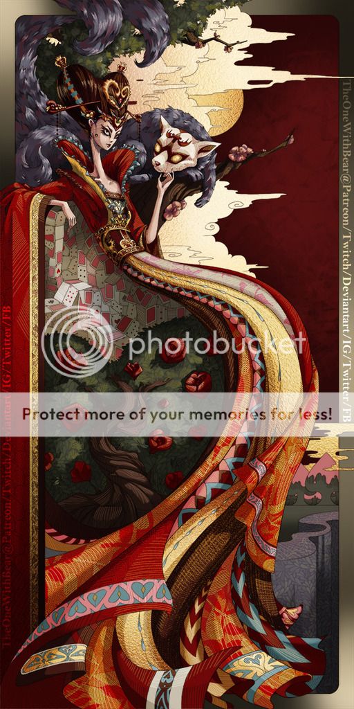
FEATURED ART: Queen of Hearts (Alice in Wonderland) by TheOneWithBear
DD DATE: 2016-09-05
TIME SPENT: Estimated to be about 30-40 HRS
(I streamed the process of the painting, the total time spent was over 150 HRS)
TOOLS/PROGRAMME: Adobe Photoshop CS6 and Intuos 3 for the majority of the drawing.
I was able to use a Cintiq 22HD when I started on the hatching.
 by TheOneWithBear")
Thanks to TheOneWithBear for kindly consenting to the interview!
Make sure to visit her gallery to see other great paintings:
DD DATE: 2016-09-05
TIME SPENT: Estimated to be about 30-40 HRS
(I streamed the process of the painting, the total time spent was over 150 HRS)
TOOLS/PROGRAMME: Adobe Photoshop CS6 and Intuos 3 for the majority of the drawing.
I was able to use a Cintiq 22HD when I started on the hatching.
Share with readers the details of how this piece came into being. Did you have a clear story idea/inspiration from the beginning?
“Queen of Hearts” is a beautiful stylistic accomplishment. Can you walk us through your process on the painting and the techniques you applied?

Bonus question: Can you cite a memorable reaction to this piece in the comments at DA?
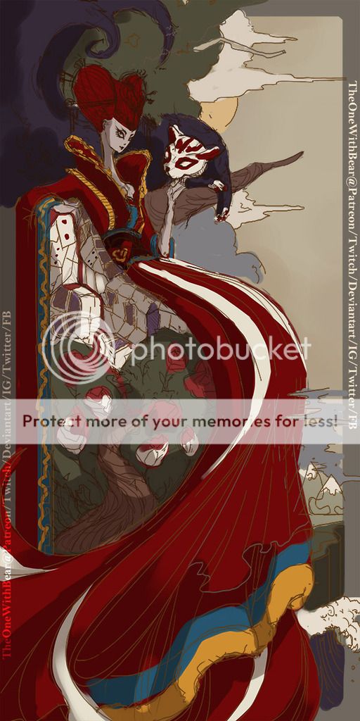
I was invited to stream on Adobe’s channel on Twitch back in May. The theme for that week’s show was Fairy Tale. I instinctively chose to interpret Alice in Wonderland, as its over-the-top stories have always been very inspiring to me.
Having grown up in the East, I was heavily influenced by oriental arts and styles. I love the muted tones of Ukiyo-E, and have always been fascinated by traditional Chinese and Japanese fabric patterns and designs.
It was a natural conclusion that I’d re-imagine the Queen of Hearts in Chinese empress dress with an elongated figure and Mucha’s elegant, vertically framed style."
“Queen of Hearts” is a beautiful stylistic accomplishment. Can you walk us through your process on the painting and the techniques you applied?
I used to do traditional art when I was a lot younger, ink and lines were my comfort zone. When I first started digital last October, I wasn’t used to the way digital paint layers, so I did a series of Naruto fanart using what I was comfortable with: lines. Since then, I moved onto learning how to properly blend digitally, and decided to revisit this style because I wanted to give this painting a traditional, hand drawn look."
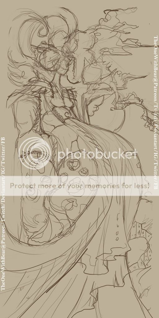
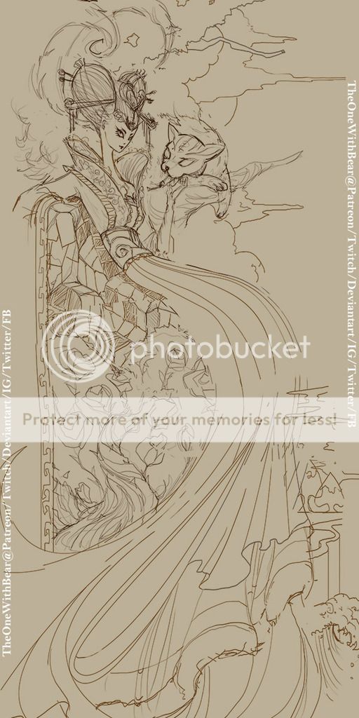
1. I started with a very rough sketch
2. Refined compositions, proportions, and roughly sketched in the main elements that would make the piece (poker card chair, rose bush, Cheshire’s mask etc.)
3. I then very quickly marked down the colour palette. This step is particularly important to me because it gives me a rough idea of where the weight of the piece would be, and gives me a chance to adjust my composition accordingly. Digital line work takes a lot of time for me due to disconnection, so I try to settle everything in this step to prevent changing my line work around later on (which still happened inevitably, haha)
4. Finished the line work and pattern details. I created the patterns with “hearts” in mind, most of the patterns were based around the shape of a heart. This step took the longest, each curve on her dress took me around 20 tries… I ended up having to adjust my composition after I finished cleaning up the lines, as she wasn’t leaning back enough.
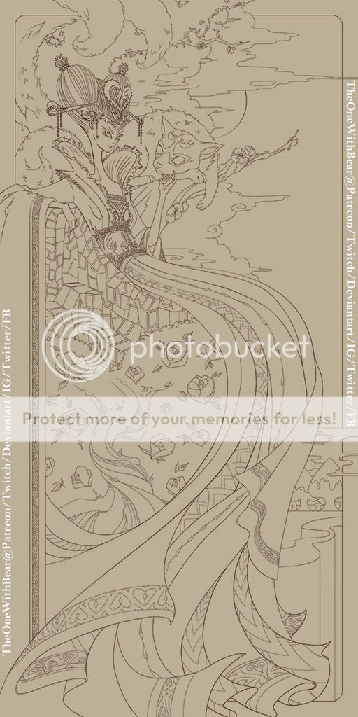
5. Laid down flat colours.
6. Used Curves to create a darker shade and masked out the light source.
7. This step is where hatching came in. I used hatch lines to add texture, colour variation, shadows and highlights.
8. I put in even darker cast shadows when I didn’t think I’d be able to achieve it with hatching.
9. Before looking for textures, I had a specific look in mind. I knew I wanted heavy cloth, Chinese symbols, simplified leave patterns and gold foil. This saves me from spending too much time looking for the right textures. I used liquify to make the textures flow in the directions and folds of my design.This was supposed the last step of my painting, and at one point I thought I was done.
10. Fix the problem with my painting. (This will be explained later on)
11. Still not happy, continued to analyse the problem.
12. Found the problems and fixed them.
Did you encounter any creative challenges when working on the piece? If so, how did you tackle them? Is there anything you would do differently now if you could?
A common challenge with digital painting for me is deciding when it is “finished”. It is so easy to change colours and contrast around, that I need to differentiate between knowing a piece is really missing something, or I’m just being finicky.
At step 09, I thought I was done, but I couldn’t shake the feeling that it lacked the impact I wanted. I was very unhappy with the card deck and its shadows, and I thought the background looked unfinished in comparison to her dress.
I solved the problem by giving the background a dark red to push it back, giving the painting more depth. I then duplicated the hatch lines to make them a lot more obvious, and soften the shadow on the card deck.
This created a new issue where the frame looked annoyingly thick and unfinished. (Well, it didn’t create it, just made it more obvious). Instead of 4 dark corners, I highlighted 2 opposing corners to give it more definition and also bring out Cheshire’s tails.
I ended up applying gold foil to the frame so the whole painting would look consistent in colours and textures.
I wouldn’t say I’d do anything differently. I don’t actually have a structured way of drawing or painting. I do things as I go and let instincts guide me, therefore, I sometimes make the same mistakes in different paintings, haha. I try to bring what I learned in one painting to the next, instead of thinking how I would make a finished painting better."
What’s one piece of advice that you would share with other artists hoping to reach this standard of work in the future?
Be patient and be persistent! Every mistake and ugly line we make in any painting is a stepping stone to the next line being better. The only difference between a “good” and a “bad” artist is that the bad artist gave up!"
What does this DD feature represent or mean to you at this stage of your artistic development? What can your watchers look forward to next?
It honestly came to me as a shock. I thought my notification glitched when I logged in, hahaha. This is a huge encouragement and I cannot thank you all enough.
As an artist, I constantly struggle with consistency in my work as I don’t stick to one style. This elongated, distorted look is something I’d given up on years ago. I revisited it partially due to nostalgia and was not expecting a lot of feedback. It is heartwarming to see that people appreciate a style that I’d always felt slightly insecure about. Words cannot describe it.
I will continue to explore painting methods and bring different techniques and styles to the table, and patiently have them morph together with time."
Bonus question: Can you cite a memorable reaction to this piece in the comments at DA?
I’d want to cite everyone because anyone taking their time to comment on anything I do is greatly cherished in equal amount!"
Thanks to TheOneWithBear for kindly consenting to the interview!
Make sure to visit her gallery to see other great paintings:
Previous Decoding DDs:
Dragon Watchers
The journey and the big fish
Forrest Defender
Red Snow
Catching Spirits
No kings and No Queens
The Tomb King
I'm fine
Despoiled
Cat Girl
Forest of Bunnies
The Journey
Boulderback
FIELD OF THORNS: OFFER
Malavestros: Muse of Madness
Jet Futura
The Northern Administration
Prisoned Singer
Don Kichote
On The Hunt
The Platform
I know a bank
Love and war
52Hz
Chase, The Dreamer
Mad
Until the End of the World..
Crow Temple
Accolade
Dragon's Breath
Spread some cheer by leaving a comment and/or on works that you like!
Want to suggest a DD? See the link to my guidelines below!
Dragon Watchers
The journey and the big fish
Forrest Defender
Red Snow
Catching Spirits
No kings and No Queens
The Tomb King
I'm fine
Despoiled
Cat Girl
Forest of Bunnies
The Journey
Boulderback
FIELD OF THORNS: OFFER
Malavestros: Muse of Madness
Jet Futura
The Northern Administration
Prisoned Singer
Don Kichote
On The Hunt
The Platform
I know a bank
Love and war
52Hz
Chase, The Dreamer
Mad
Until the End of the World..
Crow Temple
Accolade
Dragon's Breath
Spread some cheer by leaving a comment and/or
Want to suggest a DD? See the link to my guidelines below!