ShopDreamUp AI ArtDreamUp

Deviation Actions


Description
That f*cking sky V-V Its dead to me.
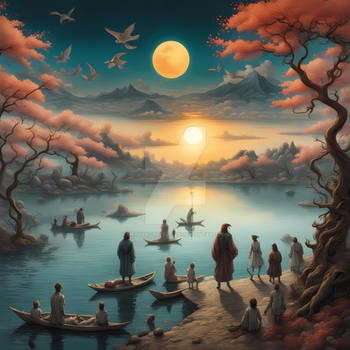
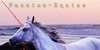
Hii, So I haven't done a manip in a while ^^' But I needed an avatar and stuff for a new RPG-SIM I've joined (Even though its got nothing to do with fantasy, I still did fantasy). This is of my main OC, Kaimaa. Kaimaa is my bae x'D If you can't already till, Kaimaa is a mythical horse. Got 'em wings and 'em horns. Got 'em fancy tattoos too (So proud of myself for remembering them x'D)
I'd love any feedback, really! I'd really like feedback to help me improve, but if you just want to tell me you love it then please do. Every little bit helps <3
However if you want to tell me its shit, then forgot you x'D
Thank yous!
Horse stock: Colourize-Stock, fav.me/d7ree7n
Wings: DarkBeforeDawn23, fav.me/d91h9qd
Horns: Sassy-Stock, fav.me/d24943l
Tail: consideritfox, fav.me/d5zqwjb
Mane: MustangStock, fav.me/d3f4ezs
Main background: prints-of-stock fav.me/d4a1ak5
Mountains: EveLivesey fav.me/d5uo5lh
Sky (Such a pretty picture, why wouldn't stay pretty for me ;-; ): duskbeguile, fav.me/d59pryk
Everything else, was done by me ~<3
Image size
900x675px 510.96 KB
© 2016 - 2024 kaimaa
Comments5
Join the community to add your comment. Already a deviant? Log In
I come bearing loves and critiques! First off, I absolutely love the color tones you used throughout the whole piece and how the darkness, color choices, and background choices all aim toward the same vibe. It has a very pleasing cohesiveness and really impressed this haunting, beautiful stillness. You also did an excellent job blending all the pieces together, especially in the background. I actually had to check the stock to see if you'd used multiple background pictures or not because it's so seamless, and that's about the ultimate compliment for a photomanipulator!
On some critique points, I'd love to see your copyright less dominating. Between the size and brightness, it's the focal point of the entire art piece, and that's far from desired. Copyrights should be subtle, easily overlooked so that the viewer can appreciate the art. Another tip is to think about balancing your image's composition; there is a ton of tutorials about it, things like "rule of thirds" and all these grids and stuff, but I always get confused and feel it's too complicated. Personally, I put it this simply: think of the image as a balance board. All of the "objects" have a weight and you need to keep it balanced. In this case, the moon and the horse are the 2 big weights on this image and they're both on the left side, which makes the right side too light and the board would tip over. Visually, it's just less appealing to bulk it all in one spot that way. Keeping with the idea of "balancing" it by weight, putting the moon and horse on a diagonal (so moving the horse to the bottom right or flipping the sky to have the moon at the top right) would enhance the visual appeal. Lastly, and this may just be on my computer, the image is very dark and all of the details are mainly lost in it. Darkness is great to 1) hide mistakes or lack of detail, 2) really project a specific vibe, and 3) tie the whole image together, but too much darkness can make it visually confusing and lose the subject's appearance. A solution is either lightening the darkness or adding more light to counteract the dark, so that the eye can focus on various features and details that are highlighted instead of losing the focus in a similarly-shaded setting.
Hope some of that helped! I can't wait to see more from you and I'm honored you requested I give feedback