ShopDreamUp AI ArtDreamUp
Deviation Actions

Hi, it's Nemicrow again and I apologize for posting late. This is probably the last time, I, personally will be discussing outdoor environments for a while. At least here. However there are other admins, who will discuss what they want. At the moment though this journal is probably the limit of my expertise in outdoor environments.
Last time we talked about environments and I briefly covered their importance. and the way any background affects a piece of work. They help create emotion and forward a narrative. This time, we will be discussing in depth how each background interacts with narratives, and plays with our minds in terms of symbolism and emotion.
I will lump some backgrounds together, as this journal needs a limit. We will cover them into three groups. The groups are, I. Open Water, Underwater, Water side, II. Forests, Swamps, Deserts, Mountains, Stones, Permanent-Frost, Suburban area. III. Medieval, Cities , Weather, and finally Specialization in Fantasy Environments. Group I. and half of group two will be covered in this journal.
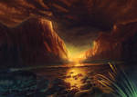
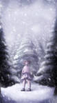
:bigthumb680457815: This environment shows a wonderful mix of different things together. It's a good example of what a mixed background should look like.
I.
Open Water:
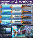
Open water has an interesting effect. The deeper the water, the bluer it looks. If it's rea shallow, like a stream, or a beachhead, then you will see through it. If it's deeper, it will reflect things more often. Using grey blues, or a similar colour scheme to the sky. The colours during a storm are quite different, they can go between green to dark navy.
Examples:

Tutorials: :thumb683147361: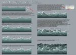

Underwater:
Drawing underwater scenes means looking at physics in a different way. The only way a Blue Whale can (as a species) survive on Earth, is by having the water hold it's weight up, this shows how the mass and weight of something underwater is different from what it would be if it lived above sea level. It's partially why humans float, and it's why your hair floats underwater. Everything under water will follow different rules as its surrounded by liquid instead of gas. However, the deeper you go, things get weirder. There are "winds" which are actually the currents. Coral reefs, forests of seaweed, and places like the Marinas Trench. The father down you get, the more the pressure increases, and the light decreases. Once you father away from the surface, directions like up and down will come across differently as well, but the main difference is the lighting. The further down you go (though the effects noticeable a few inches from the surface) the blue everything becomes, and the warmer colours become less visible. If you want to create an entire waterbased world for a story I would recommend the documentary series Blue Planet, produced by the BBC, as it covers every (known) part of the ocean (it's also just really fun to watch, even if you don't normally enjoy documentaries).
Examples: :thumb664472281:

Tutorials: (download only) and these are two I personally used


Water Side:
This background is one that most illustrators end up using often as it's the most common. Bigger lakes have either rocky or sandy beaches. Often bits of grass will survive in lakes. The smaller lakes are generally calmer, but rivers often have white water. These don't have a large emotional impact, though lakes will be more peaceful than rushing water.


Tutorials: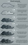

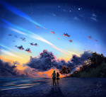
Open Skies:
It's hard to feel trapped under an open sky. The sky invokes intense emotions, though part of it has to do with the figures stance. If the figure is slouched or clutching themselves, they will seem isolated. If the figure has a confident pose, the sky with back their confidence making them wild, and a leader-like. Blue sky's are normal, however you create eeerie effects green, purple, and darker skies. Sunsets always seem to fill our imagination, though completely red skies can come across as violent.
Example: :thumb673717028: :thumb673100992:
Tutorials: :thumb255819198:

II
Forests:
Forests are tricky things, and I recommend you don't rely on TV Shows as a reference for the variety of types forests. The reason? The majority are shot in BC Canada, and definitely in the same woods. Look at Contimuuns forest scenes, Them look at The Circles (the show, not movie) forest scenes if you don't believe me. In the Flash, it was noticeable that they were in a similar kind of woods. Rain Forests look entirely different, Forests in Asia has a complimentary different set of species in them, and Forests replanted after logging are often pine. Decide what region your emulating, then look for stock from that region.
Despite the differences in their appearances, Forests have a simlar meaning in art, no matter what kind they are. Hey make characters seem closer to nature, and in danger if there are lot of predators in the picture.


Tutorials:


Swamps:
Just like forest, swamps are region specific. Many people find swamps as dark, scary places, filled with bugs. These can be true, but swamps and marshlands have incredibly complicated ecosystems. You and your characters might want to be careful where you step though. If you want to see a ton of swamps google "Magic Card, Land, Swamps" and you'll see hundreds of different takes on swamps. Anything that lives in a swamp will have to be comfortable on both land and in water. They might also have a resistance to the other inhabitants of the swamp (like the use of a mosquito net, or knows where the best water sources are.)


Tutorials:
Mountains:
Mountains are grand things, they tower above us, shows how small the rest of the world is. The impact they can have on a piece or art work can therefore also be grand. During the day, they can cast shadow over the areas beneath them. If wish yo paint them in oils or acrylic; I would suggest looking up Bob Ross, and his tv series. In terms of plot and symbolism, mountains can often end up being a great challenge for the characters, or a place to hide something (like a dragon).
Examples:

Tutorials: :thumb127172455:
Plains:
Plains or Feilds are really simple, and don't have a emotional effect in themselves. Most fields are not just one colour of grass, but multiple grasses, and other plants. This is why you'll see bits of colour in fields. You can also have field that are fillled with flowers, allowing you more creative liberty when it comes to colour choice. Grass itself can be green or brown, or even yellow.
examples:


Tutorials: :thumb330837080:
Stones:
Stones come in many shapes and sizes, what will control the mood is their edges, and your characters placement to the stones. If there's a pile of stones in front of the character, it seems like a challenge. If the character is on the top of the pile of stones, the look like they've completed a challenge, and possibly gained something. The most important thing to remember is that stones aren't just one type of grey.
Examples:
Tutorials:


Desert:
We had surprisingly few deserts in the group. In any narrative, large areas of sand (that aren't a beach) can help create a sense of danger and of isolation. They do this as it's much easier to be lost in a desert. Just lik swamps, anything that lives there will have to have adapted to the environment.
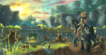
Examples: :thumb633772195:![[Commission] Epic Battle by Margo-sama](https://images-wixmp-ed30a86b8c4ca887773594c2.wixmp.com/f/ebc954bc-c11c-41eb-9169-e70b840c7545/dawlizp-55a3a4b9-0aef-4d0f-90e4-6c01dd944a40.png/v1/fit/w_150,h_150,q_70,strp/_commission__epic_battle_by_margo_sama_dawlizp-150.jpg?token=eyJ0eXAiOiJKV1QiLCJhbGciOiJIUzI1NiJ9.eyJzdWIiOiJ1cm46YXBwOjdlMGQxODg5ODIyNjQzNzNhNWYwZDQxNWVhMGQyNmUwIiwiaXNzIjoidXJuOmFwcDo3ZTBkMTg4OTgyMjY0MzczYTVmMGQ0MTVlYTBkMjZlMCIsIm9iaiI6W1t7ImhlaWdodCI6Ijw9MTMwMCIsInBhdGgiOiJcL2ZcL2ViYzk1NGJjLWMxMWMtNDFlYi05MTY5LWU3MGI4NDBjNzU0NVwvZGF3bGl6cC01NWEzYTRiOS0wYWVmLTRkMGYtOTBlNC02YzAxZGQ5NDRhNDAucG5nIiwid2lkdGgiOiI8PTk3NSJ9XV0sImF1ZCI6WyJ1cm46c2VydmljZTppbWFnZS5vcGVyYXRpb25zIl19._wOHhZlmuMNVc8BbQD3_pUFkvqJl3BSfU280fNeUPYI) :thumb675332954:
:thumb675332954:
Tutorials: (ground)
(sand, and beach)
(ground)
(sand, and beach)
Perma-Frost:
Arctic Tundra, snowy areas, and frozen lakes are extremely interesting landscapes. The lighting will change here, causing highlights to be brighter and everything to be well lit, as both ice and snow will reflect sunlight. The meanings of such a landscape depend on the context, however, if you're unsure where to place characters skating, check with the safety recommendations-as the closer to shore, and the more plants there are, the more dangerous the ice.
Exampes
Tutorials:

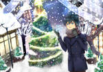
Gardens:
Gardens are tricky things. They're usually nice, but if you chose darker colours, and symbolic (or poisonous) flowers and plants, you can get an entirely different feel. Gardens come across as domestic, however many are quite huge. Usually the grass is shorter, and you will seen signs that humans use it, like paths, flowerbeds, or garbage.
Examples
 :thumb673286550:
Tutorials:
Suburban areas:
Suburbs are interesting areas. Many are filled with cookie cutter houses, that all look the same, but every now and them, you will see some that look different. To make it look less like a city, place the building father apart, include small parking lots, and (in general) put in less side walks or cross walks than a city. In many new subdivisions, the contractors will ask the local council to only put the sidewalk on one side of the road. These areas change depending on the region, so make sure to look up pictures ahead of time. Also note, it's quite common to have a small woods, or forest behind a bigger subdivision or a body of water nearby.
:thumb676500561:

III. Specialization:
Medieval:
Histoical settling probably deserve their own journal. I would recommend you look up the area you wish to have your scene in, find references, then begin to sketch out an idea. In places like York, or Istanbul, the architecture is still in full use today. Also look up any traditions of the time period, if you're unsure where to start when it comes to traditions, consider pets; did they allow cats? Dogs? Did they have work animals? Only had pets? What food did they eat? These kind of questions can help make your piece seem more believable.
 :thumb669055289:
Cities;
Every City is completely different from the next, New York is known for large high rises, monuments, but it also has wid(er) sidewalks, gargoyles, and Art Deco. The streets are very busy. Las Vegas is dressed in giant signs and gambling establishments. London is a bit like Ravinca from MTG, completely variable. Halifax NS, has more nature in the area, but it's streets are dirty, and there's a lot of construction. If you want to draw a specific city, I suggest looking up stock for that place, and checking out the street view on Google Maps.
A city is intrinsically busy, even at night. Now you may have some side roads without anyone on them, but people are still moving around at 4am. Despite the amount of people, many people feel very lonely in a city, as everyone else is rushing past them. The more greenery, or interesting artichture a place has, the more happy (In general) it will feel, consversly, smog, dirty sidewalks, and dull multi-story buildings, and the less accessible it is, the more lonely and unnerving the landscape will feel. If you want to create a sense of claustrophobia, till all the tall buildings in a little bit, so they are in the character's space. I will also note, you can get many unique lighting effects in cities, because there is so much light even at night, however because of that light (and smog) it's often hard to see stars or the moon.
Examples:


Tutorials:
Weather
This could be an entire journal by itself. Every type of weather has a different form of symbolism behind it, which depending on the context , may contradict another meaning behind it. Snow is an obvious example, it's both cold and dangerous, but also associated with the western holiday season. Storms are usually associated with trouble though. Each type of weather has a different set of colour changes and lighting changes. However, even with storms and rain, the colour is not fixed. In many areas summer storms and lightning are purple, and some of it is pure white. You need to research stock and references, as well finding a few (I suggest around 5) pieces of other people's art, which are of a similar subject matter to what you're drawing and that you find inspiring. Don't copy them, just see how they managed to portray the mood and environment you want to create.

Tutorials: :thumb331019791:
 (pretty close to a dark sky site.)
Specialization in Fantasy Environments:
Fantasy environments seem incredibly hard, and to a certain extent they are. Because I was having trouble finding good tutorials for this so here's 3 basic principles in how to make a convincing fantasy world:
-1. Internal Logic. Any moderately good fantasy has Internal Logic. In Star-Trek, Earth is utopian, in Game Of Thrones dragons are very rare, In Steven Universe everyone is in candy colours or jewel tones. These are rules that are consistent throughout the series. If the Internal Logic is applied consistently, you won't break the suspension of disbelief.
-2. Realism: This doesn't contradict the first point. You can have a world where you can turn steel into gold, but that wouldn't mean that a gold needle would suddenly break a steel wall. Unless breaking physics is part of the world (RWBY, High School of the Dead) then try not to break it when you don't need to. When possible, keep it real.
-3.Practice: Use references, practice drawing your world as much as you can. The 15 stone will be easier to paint the 1st, no matter what colour it is.


 :
:
Here are some general background resources to help you:

 :thumb310564417:
I'm sorry for this being do late, I hadn't meant to let it get this big (over 2,000 words). Each of these topics could be covered in a greater depth, but it's harder to do on this journal series as there's a focus on colour. Please look at the rest of our journals for more information of colour and colour related things.
I will finish off with a shoutout to two members ; pin100 and chateaugrief . So much the art in this journal and in the Environmental folder is theirs. They have incredible landscapes so please go have a look at their galleries!
Last time we talked about environments and I briefly covered their importance. and the way any background affects a piece of work. They help create emotion and forward a narrative. This time, we will be discussing in depth how each background interacts with narratives, and plays with our minds in terms of symbolism and emotion.
I will lump some backgrounds together, as this journal needs a limit. We will cover them into three groups. The groups are, I. Open Water, Underwater, Water side, II. Forests, Swamps, Deserts, Mountains, Stones, Permanent-Frost, Suburban area. III. Medieval, Cities , Weather, and finally Specialization in Fantasy Environments. Group I. and half of group two will be covered in this journal.
:bigthumb680457815: This environment shows a wonderful mix of different things together. It's a good example of what a mixed background should look like.
I.
Open Water:
Open water has an interesting effect. The deeper the water, the bluer it looks. If it's rea shallow, like a stream, or a beachhead, then you will see through it. If it's deeper, it will reflect things more often. Using grey blues, or a similar colour scheme to the sky. The colours during a storm are quite different, they can go between green to dark navy.
Examples:
Tutorials: :thumb683147361:
Underwater:
Drawing underwater scenes means looking at physics in a different way. The only way a Blue Whale can (as a species) survive on Earth, is by having the water hold it's weight up, this shows how the mass and weight of something underwater is different from what it would be if it lived above sea level. It's partially why humans float, and it's why your hair floats underwater. Everything under water will follow different rules as its surrounded by liquid instead of gas. However, the deeper you go, things get weirder. There are "winds" which are actually the currents. Coral reefs, forests of seaweed, and places like the Marinas Trench. The father down you get, the more the pressure increases, and the light decreases. Once you father away from the surface, directions like up and down will come across differently as well, but the main difference is the lighting. The further down you go (though the effects noticeable a few inches from the surface) the blue everything becomes, and the warmer colours become less visible. If you want to create an entire waterbased world for a story I would recommend the documentary series Blue Planet, produced by the BBC, as it covers every (known) part of the ocean (it's also just really fun to watch, even if you don't normally enjoy documentaries).
Examples: :thumb664472281:
Tutorials:
Water Side:
This background is one that most illustrators end up using often as it's the most common. Bigger lakes have either rocky or sandy beaches. Often bits of grass will survive in lakes. The smaller lakes are generally calmer, but rivers often have white water. These don't have a large emotional impact, though lakes will be more peaceful than rushing water.
Tutorials:
Open Skies:
It's hard to feel trapped under an open sky. The sky invokes intense emotions, though part of it has to do with the figures stance. If the figure is slouched or clutching themselves, they will seem isolated. If the figure has a confident pose, the sky with back their confidence making them wild, and a leader-like. Blue sky's are normal, however you create eeerie effects green, purple, and darker skies. Sunsets always seem to fill our imagination, though completely red skies can come across as violent.
Example: :thumb673717028: :thumb673100992:
Tutorials: :thumb255819198:
II
Forests:
Forests are tricky things, and I recommend you don't rely on TV Shows as a reference for the variety of types forests. The reason? The majority are shot in BC Canada, and definitely in the same woods. Look at Contimuuns forest scenes, Them look at The Circles (the show, not movie) forest scenes if you don't believe me. In the Flash, it was noticeable that they were in a similar kind of woods. Rain Forests look entirely different, Forests in Asia has a complimentary different set of species in them, and Forests replanted after logging are often pine. Decide what region your emulating, then look for stock from that region.
Despite the differences in their appearances, Forests have a simlar meaning in art, no matter what kind they are. Hey make characters seem closer to nature, and in danger if there are lot of predators in the picture.
Tutorials:
Swamps:
Just like forest, swamps are region specific. Many people find swamps as dark, scary places, filled with bugs. These can be true, but swamps and marshlands have incredibly complicated ecosystems. You and your characters might want to be careful where you step though. If you want to see a ton of swamps google "Magic Card, Land, Swamps" and you'll see hundreds of different takes on swamps. Anything that lives in a swamp will have to be comfortable on both land and in water. They might also have a resistance to the other inhabitants of the swamp (like the use of a mosquito net, or knows where the best water sources are.)
Tutorials:
Mountains:
Mountains are grand things, they tower above us, shows how small the rest of the world is. The impact they can have on a piece or art work can therefore also be grand. During the day, they can cast shadow over the areas beneath them. If wish yo paint them in oils or acrylic; I would suggest looking up Bob Ross, and his tv series. In terms of plot and symbolism, mountains can often end up being a great challenge for the characters, or a place to hide something (like a dragon).
Examples:
Tutorials:
Plains:
Plains or Feilds are really simple, and don't have a emotional effect in themselves. Most fields are not just one colour of grass, but multiple grasses, and other plants. This is why you'll see bits of colour in fields. You can also have field that are fillled with flowers, allowing you more creative liberty when it comes to colour choice. Grass itself can be green or brown, or even yellow.
examples:
Tutorials: :thumb330837080:
Stones:
Stones come in many shapes and sizes, what will control the mood is their edges, and your characters placement to the stones. If there's a pile of stones in front of the character, it seems like a challenge. If the character is on the top of the pile of stones, the look like they've completed a challenge, and possibly gained something. The most important thing to remember is that stones aren't just one type of grey.
Examples:
Tutorials:
Desert:
We had surprisingly few deserts in the group. In any narrative, large areas of sand (that aren't a beach) can help create a sense of danger and of isolation. They do this as it's much easier to be lost in a desert. Just lik swamps, anything that lives there will have to have adapted to the environment.
Examples: :thumb633772195:
:thumb675332954:Tutorials:
Perma-Frost:
Arctic Tundra, snowy areas, and frozen lakes are extremely interesting landscapes. The lighting will change here, causing highlights to be brighter and everything to be well lit, as both ice and snow will reflect sunlight. The meanings of such a landscape depend on the context, however, if you're unsure where to place characters skating, check with the safety recommendations-as the closer to shore, and the more plants there are, the more dangerous the ice.
Exampes
Tutorials:
Gardens:
Gardens are tricky things. They're usually nice, but if you chose darker colours, and symbolic (or poisonous) flowers and plants, you can get an entirely different feel. Gardens come across as domestic, however many are quite huge. Usually the grass is shorter, and you will seen signs that humans use it, like paths, flowerbeds, or garbage.
Examples
:thumb673286550:Tutorials:
Suburban areas:
Suburbs are interesting areas. Many are filled with cookie cutter houses, that all look the same, but every now and them, you will see some that look different. To make it look less like a city, place the building father apart, include small parking lots, and (in general) put in less side walks or cross walks than a city. In many new subdivisions, the contractors will ask the local council to only put the sidewalk on one side of the road. These areas change depending on the region, so make sure to look up pictures ahead of time. Also note, it's quite common to have a small woods, or forest behind a bigger subdivision or a body of water nearby.
:thumb676500561:
III. Specialization:
Medieval:
Histoical settling probably deserve their own journal. I would recommend you look up the area you wish to have your scene in, find references, then begin to sketch out an idea. In places like York, or Istanbul, the architecture is still in full use today. Also look up any traditions of the time period, if you're unsure where to start when it comes to traditions, consider pets; did they allow cats? Dogs? Did they have work animals? Only had pets? What food did they eat? These kind of questions can help make your piece seem more believable.
:thumb669055289:Cities;
Every City is completely different from the next, New York is known for large high rises, monuments, but it also has wid(er) sidewalks, gargoyles, and Art Deco. The streets are very busy. Las Vegas is dressed in giant signs and gambling establishments. London is a bit like Ravinca from MTG, completely variable. Halifax NS, has more nature in the area, but it's streets are dirty, and there's a lot of construction. If you want to draw a specific city, I suggest looking up stock for that place, and checking out the street view on Google Maps.
A city is intrinsically busy, even at night. Now you may have some side roads without anyone on them, but people are still moving around at 4am. Despite the amount of people, many people feel very lonely in a city, as everyone else is rushing past them. The more greenery, or interesting artichture a place has, the more happy (In general) it will feel, consversly, smog, dirty sidewalks, and dull multi-story buildings, and the less accessible it is, the more lonely and unnerving the landscape will feel. If you want to create a sense of claustrophobia, till all the tall buildings in a little bit, so they are in the character's space. I will also note, you can get many unique lighting effects in cities, because there is so much light even at night, however because of that light (and smog) it's often hard to see stars or the moon.
Examples:
Tutorials:
Weather
This could be an entire journal by itself. Every type of weather has a different form of symbolism behind it, which depending on the context , may contradict another meaning behind it. Snow is an obvious example, it's both cold and dangerous, but also associated with the western holiday season. Storms are usually associated with trouble though. Each type of weather has a different set of colour changes and lighting changes. However, even with storms and rain, the colour is not fixed. In many areas summer storms and lightning are purple, and some of it is pure white. You need to research stock and references, as well finding a few (I suggest around 5) pieces of other people's art, which are of a similar subject matter to what you're drawing and that you find inspiring. Don't copy them, just see how they managed to portray the mood and environment you want to create.
Tutorials: :thumb331019791:
Specialization in Fantasy Environments:
Fantasy environments seem incredibly hard, and to a certain extent they are. Because I was having trouble finding good tutorials for this so here's 3 basic principles in how to make a convincing fantasy world:
-1. Internal Logic. Any moderately good fantasy has Internal Logic. In Star-Trek, Earth is utopian, in Game Of Thrones dragons are very rare, In Steven Universe everyone is in candy colours or jewel tones. These are rules that are consistent throughout the series. If the Internal Logic is applied consistently, you won't break the suspension of disbelief.
-2. Realism: This doesn't contradict the first point. You can have a world where you can turn steel into gold, but that wouldn't mean that a gold needle would suddenly break a steel wall. Unless breaking physics is part of the world (RWBY, High School of the Dead) then try not to break it when you don't need to. When possible, keep it real.
-3.Practice: Use references, practice drawing your world as much as you can. The 15 stone will be easier to paint the 1st, no matter what colour it is.
:Here are some general background resources to help you:
I'm sorry for this being do late, I hadn't meant to let it get this big (over 2,000 words). Each of these topics could be covered in a greater depth, but it's harder to do on this journal series as there's a focus on colour. Please look at the rest of our journals for more information of colour and colour related things.
I will finish off with a shoutout to two members ; pin100 and chateaugrief . So much the art in this journal and in the Environmental folder is theirs. They have incredible landscapes so please go have a look at their galleries!

HG Designs Subscriber Area
Lots of high resolution goodies for graphic design including textures, photoshop brushes, seamless patterns and more.
$8/month
List of All Weekly Journals
Hi, to restart the journals in 2018, I'm posting a complete list of all our journals. As some of you know, we've been using this :thumb638719959: as a list, however this should be easier to find. :heart:
Quick List of Sections:
1. Colour Theory Journals
2. 'The Colour:' Journals
3. Generalized Journals (with subsections)
4. Traditional Colouring
5. Digital Colouring
1. Colour Theory Journals
Colour Theory (Journal 15) http://cloud-of-colours.deviantart.com/journal/Weekly-Journal-15-Color-Theory-611976070
Hue, Saturation and Value http://cloud-of-colours.deviantart.com/journal/EDIT-Hue-Saturation-and-Value-Weekly-Jo
Comics, The bare bones : Weekly Journal 48
The Bare Bones of Sequential Panels.
This journal is a little like anatomy, or shading practice, it seems disjointed, but we need these parts to hold our comics together. It gives one a firm starting point, which can then be used to create something else. However, I recommend you look at other sources of information as well.
Terminology:
:bigthumb656085359:
There are a few terms I wish to clarify before I start the main part of the comic. These terms are just from https://en.m.wikipedia.org/wiki/Glossary_of_comics_terminology , though most of them come from Scott McCloud’s books. If you have the pleasure of studying a graphic
Monochromatic Color Scheme- Weekly Journal 47
Greetings everyone~ fizzypopcake (https://www.deviantart.com/fizzypopcake) ~fizzypopcake (https://www.deviantart.com/fizzypopcake) here. This marks as my very first journal entry for this group :D I hope I’ll be able instill some useful info just like how my respectable co-admins did~
:iconleafborderplz::iconleafborderplz::iconleafborderplz::iconleafborderplz::iconleafborderplz::iconleafborderplz::iconleafborderplz::iconleafborderplz::iconleafborderplz::iconleafborderplz:
For this week’s journal, we would be talking about monochromatic color schemes.
Now some would perhaps think that monochrome illustrations would only entail colors of black and white but in actuality, it also in
Spooky Colouring - Weekly Journal 46
I need to start off on a sour note... please do NOT POST ADOPTABLES in unrelated folders. We have an adoptable folder, adoptables go in there that way anyone looking to buy can find you.
ADOPTABLES GO IN THE ADOPTABLE FOLDER. PLEASE~
Right, Ok, Good.
We are about to enter October, well known in present time for spooky happens, sweets, chocolate and Inktober (we have a journal relating to that next week). We are about to see a overwhelming amount of Halloween based art, so let's go over what it takes to make a creepy/horror based image.
1) Lighting-
A running theme with this journal will be avoiding the natural way. So for lighting by defaul
Featured in Groups
© 2017 - 2024 Cloud-Of-Colours
Comments18
Join the community to add your comment. Already a deviant? Log In
Thank you for featuring my work in this guide ^_^ I'm glad you found it to be a fitting example! 