ShopDreamUp AI ArtDreamUp

Deviation Actions


Description
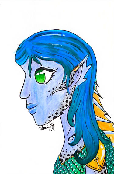
When I planned this painting, I wanted to make it big enough so I could paint the eyes as I couldn't do on a smaller scale. I'm also adding color all around.
So now, before I go further...How can I take this from a "WIP" to "Finished"? What suggestions do you have?
1. I will probably add more fine brush work to make the hair more stringy, with highlights.
2. I planned adding a dark brown wash over the background, so the cool shades would pop. What do you think?
3. I will probably continue to make the eye whites less...White. Maybe shadows indicating eyelids? I probably should do something with her lips, too.
4. The eyes I will keep the most vibrant, but should I strengthen the color everywhere else, or keep the tainted vintage look?
Thanks for your feedback. (Smile)")
It looks like this with just grisaille: fav.me/dcajlsi
It looks like this without paint: fav.me/dbtks2f
These are characters presented in my first comic, Concerning Rosamond Grey. You can read it here: fav.me/d7pi52p
So now, before I go further...How can I take this from a "WIP" to "Finished"? What suggestions do you have?
1. I will probably add more fine brush work to make the hair more stringy, with highlights.
2. I planned adding a dark brown wash over the background, so the cool shades would pop. What do you think?
3. I will probably continue to make the eye whites less...White. Maybe shadows indicating eyelids? I probably should do something with her lips, too.
4. The eyes I will keep the most vibrant, but should I strengthen the color everywhere else, or keep the tainted vintage look?
Thanks for your feedback.
It looks like this with just grisaille: fav.me/dcajlsi
It looks like this without paint: fav.me/dbtks2f
These are characters presented in my first comic, Concerning Rosamond Grey. You can read it here: fav.me/d7pi52p
For easier reading, check out the comic at: rosamondgrey.smackjeeves.com
Synopsis:
In the late 19th century, little Rosamond Grey sneaked into the woods one night, and was found unconsciousness the next day. For years afterwards she suffers from seizures from an unknown ailment. Dr. Glass is loosing hope for her cure, until a strange foreigner hints of a different cause…
Image size
4000x3000px 9.34 MB
Make
Panasonic
Model
DMC-FZ200
Shutter Speed
1/60 second
Aperture
F/2.8
Focal Length
14 mm
ISO Speed
100
Date Taken
May 9, 2017, 10:07:38 AM
© 2018 - 2024 Hestia-Edwards
Comments9
Join the community to add your comment. Already a deviant? Log In
There's a lot of things that I think are good with this piece.
The thing that tied everything together was the background. It has a really nice textured look to it and the colors help to make the characters pop out while not clashing harshly. I also like the lining of the initial lines of the hair and horns. They help to give detail without being too distracting.
The main problem I can see is with the anatomy. Both of your characters have their eyes too close to the top of their head. While there are styles where the forehead is nonexistent, I don't think that's what you were going for here.
The last main issue I see is that your texture lining gets a bit "lazy" at certain points. You can see it in the hair of the girl. The outer layers of hair are well done and the lines go down and follow the hairline; however, in the inner layers it seems sloppily done or rushed. You can also see it in the girl's eyebrows, where the sketchy outline contrasts with the crisp lining of the rest of the piece.