ShopDreamUp AI ArtDreamUp
Deviation Actions
Apparently Ernest Hemingway was the one who said that "The only kind of writing is rewriting". I've learned that art can be like that too. I thought I'd take you through my process for creating page 5, Chapter 7 of Raiders of the Lost Eye to show you what I mean.
When it comes to comics, especially this big fantasy epic I've got going on, I prefer to work from a script. That way I know ahead of time what I'm going to need to create visually. So for this page I already had the dialogue written. I knew it would portray Duster, her powers magically restored thanks to a talisman she found/claimed, confronting this fantasy world's version of her enemy Count Lukas von Hartig. This von Hartig is a slave-dealer rather than a big game hunter, and a male chauvinist to boot. He's a villain in very much in need of a comeuppance, which Duster would deliver in this scene.
I began by loading the file for the last panel from the previous page into Daz Studio.
For serials, this is a handy technique. The figures, props, lighting, and everything else are already loaded in the previous scene's file. It's just a matter of repositioning things, adjusting the camera angle and lighting... easy, right?
Well, not for a big, single-page splash I've been building towards for some time. It took some extra work.
Since the image was really about Duster confronting von Hartig, I removed the three henchmen to provide the image with some clear focus. Duster would dominate the image. I imagined her floating/flying in a pose that conveys power and control. von Hartig would be hurtling through the air, looking at her in terror. She'd be above him in the image, underlining who has the upper hand (literally!). And since it's a comic page with dialogue, I needed to ensure that there was room for the word balloons.
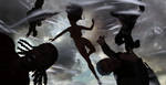
Here's my first attempt:

If you have a look at the last panel from the previous page you'll see it has a backlit effect, making the characters into little more than silhouettes. All the light is coming from a HDRi wrap-around image, with the brightest part of the HDRi behind the characters. For this following page I wanted the two characters better lit so I rotated the HDRi 180 degrees, attempting to have the HDRi's brightest part shining onto their fronts and faces. As you can see, the HDRi provides some nice ambient light, but not really enough to properly illuminate the characters. I decided to add some spotlights. I loaded the image into Comic Life 3 where I had the dialogue ready and waiting. Duster's position interfered with the "attribution tails" of her word balloons, so I had to adjust the camera angle and her left arm's pose to accommodate them.
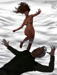
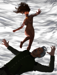
Here's the second attempt:

This was slightly better; you can see Duster much more clearly. Still, I wasn't completely happy with it. This was a big moment, and this just didn't look dramatic enough. I decided to keep the HDRi for its ambient lighting but to turn off the "Draw Dome" option so it wasn't visible. Instead, I left the image background empty (transparent, actually) so I could put in a different graphic.
I decided to have a big lightning bolt behind Duster; there's your drama! Now, I had used a lightning bolt HDRi for the first panel of the previous page, but I didn't want to reuse it because it would look too similar. I went through a lot of Google Images results and eventually settled on this picture:

It's smaller than my final image, but I knew I could enlarge it and then use a Gaussian blur to make it fuzzy like a depth-of-field effect. The main bolt is nice and thick, providing that appearance of bright illumination I wanted. It would appear that Duster was mainly illuminated by the lightning bolt, so I got rid of the conventional key light and instead used a bright rim light from the side.
I also added emissive lighting effects to the talisman and to Duster's eyes. I knew the talisman would be obscured in postwork in GIMP by a visual effect called a "supernova", but I wanted some yellowish light (the colour of the talisman) shining onto Duster's chin, neck, and upper chest. It would be subtle but it would sell the effect.
Duster's eyes don't normally glow when she uses her powers. And she can't normally command lightning. But I decided the eye glow would underline that there's a magical source at work to restore her wind powers... and that it has some additional effects. In addition, with Duster mainly lit from behind now, making her eyes light-emitting helped illuminate her face.

This looked better, but the light appears to be coming from the side; the lighting bolt in the image would appear behind Duster. So I had to swing the light around so it was behind her more than from the side. In addition, I thought more of the wind prop effects should be visible. I had two instances of the same prop for the whirlwind effect; I shrunk one a bit and raised it. I also added a light to illuminate von Hartig just a little.

If you compare these two images you can see how in the one immediately above, the light source illuminating Duster appears more behind her than from the side, as I wanted. The spotlight on von Hartig comes from the same angle, but I moved it in closer to him to illuminate him. It's subtle, ensuring there's a bit of a light outline on his head and clothing.
I then combined the test image with my background to see how it all looked.

You can definitely see that this is a low quality test render if you enlarge it. The idea is to quickly produce this image so I have a proof that the concept works. I also loaded it into Comic Life 3 to ensure the word balloons could be positioned properly.
I was finally happy with the lighting and positioning so it was time to produce the high-quality render. As I noted in another recent journal, the latest version of Daz Studio (4.11.0.383) has some substantial changes to the Iray render engine. One effect is that renders are faster now. This image cooked in just under a half hour:
(If you look closely at Duster's upper chest you can see the lighting I was talking about, from the emissive talisman disc.)
Besides adding the background, the image needed some postwork. As I mentioned above, I added the supernova effect to the talisman disc. I created a "glow" effect which I described in a much older tutorial. I also added a motion blur effect to Duster's hair and von Hartig's body to further sell the idea that the characters are being whipped around inside of a whirlwind. I adjusted the background image a bit, blurring it as well as adjusting the colour saturation so it's a little less pink and a little more grey, trying to get it to match the look of the sky in the previous page's last panel. Below is the final result, the image used in the comic, but without any word balloons.

I had an internal debate with myself about adding a thunder "sound effect", a "KRAK-A-BOOM" or text to that effect, but I eventually decided that it wasn't needed.
It's funny, I thought it wouldn't take as much time to create this page as previous ones, because it uses a single image rather than several panels. But having just one panel for the page meant that it had to look just right, and that took some time and experimentation.

Tip Jar
Support my work by contributing to my tip jar. This tier won't include any specific perks, but you will receive my appreciation. And Duster's!
$1/month
DusterJam 2024: The Gallery
The official journal/gallery of the art jam where the theme is alternative versions of Duster... Candy from other dimensions, and everyone's imagination! @Nathanomir opens the Jam (no surprise) with an elegant Zorro-esque version of Duster that's sure to swash your buckle! From @atomicwick we get "Diner Duster", a delicious version of my gal he created for a story some time ago: @RagingCyc0ne triples the alternatives by giving us Duster, Mistress Winter, and Min Yin... IN SPAAAAAAAAAAAAAAACE!!! (with pizza) Next up, Duster the She-Devil by @BinJIBriganD: From @misstakenmanips we get an animated GIF that, if it ever happened, would REALLY complicate my life...! A couple more from @BinJIBriganD: Duster as a medieval warrior queen and as a Jedi. (In the latter she may be running into some of the issues @Nathanomir's sword maidens were complaining about recently...) And another from @RagingCyc0ne, an homage to an unnamed 80s SF flick: @olympiaman contributes a surprise
DusterJam 2024
Announcing the first annual Duster art jam! Sure, I’ve held art jams before—both planned and impromptu—but I think I have enough followers and Duster has enough fans to justify an annual event! Similar to, and I admit partly inspired by, the art festival my buddy @Nathanomir throws for his girl Aura (which should be coming up again this August, right, Nathan?). First of all, we need a theme. This year, it will be “Alternative Duster”. Take my girl and modify her in some way: plunk her down in another time period, or insert her into your favourite pop culture franchise, or import her into your own fictional world… whatever you can imagine! Make her an elf, or a space adventurer, or a spy, or a vampire, or a 50s housewife, or… you get the idea. Just keep her recognizable, somehow! I leave the “somehow” up to you. ;) As for the situation, do whatever you choose: put her in peril, or in battle, or depict her triumphing, or, I dunno, shopping for shampoo. It’s all good! Art of
Quick Daz Tip: Extreme Closeups
Maybe a lot of you know this but I just discovered it by futzing around. If you push the camera in on something for an extreme closeup, the object will become distorted. A human face/head, in particular, will become "compressed" and look thinner than it actually should be. A fix for this is to select the camera and access its parameters. Then reduce the Frame Width (mm) setting from its default of 36. Like, maybe in half to 18. You'll then need to change the camera's position to take account of the new setting. I also find that using the mouse wheel to adjust the camera's position is too inexact, so I use Perspective View and the Translate Tool to drag it. It takes some trial and error but you can get there. There are probably other ways to do this, but I found a way that works and thought I'd share. If you know other methods, by all means share them in the comments. ;)
Favourite Environments
@nyctophobia11’s new “Thanks for Watching” image, as I pointed out to him, makes very good use of one of my favourite digital environments (more on that below). It got me thinking about other sets I commonly use. I suspect that several of my fellow digital artists have noticed me making repeated use of these, and possibly some of you who aren’t digital artists as well. The dominant feature of any image is the people, of course. But “setting”, as you’ll recall from grade school English, is another of the four basic story elements (often neglected in favour of character and plot, and sometimes theme). When I create an image I select the environment/background based upon both what I think is appropriate for the “story” the image is telling, and also for the general mood I want the picture to convey. The setting can also do an extra job of revealing character. Think about your own home: it says something about you, about who you are. In a superheroine-in-peril image, the setting is
© 2019 - 2024 Dangerguy01
Comments28
Join the community to add your comment. Already a deviant? Log In
This is an awesome tutorial. Lighting is my biggest weakness and I really admire your work.