ShopDreamUp AI ArtDreamUp
Deviation Actions

projecteducate presents: ABCs of Text Art & Typography.
Today: #1 // I - R.
Read and enjoy And maybe even learn something
  (Wink)")
Initial
Stands at the beginning of a copytext; a chapter or a paragraph. It is considerably bigger than the rest of the copy, usually several lines high. It can be a simple letter or an decorated character.
A fine example of creating initials is the Daily Drop Cap Blog by Jessica Hische.
 :thumb103628124: :thumb169289561:
Italic
Is a cursive font style based on handwriting. The typeface is usually slanting to the right, on serif fonts serifs and vertical lines may become rounder and curvy; on sans serif fonts occasionally serifs are added on the italic style.
It is supposed to be the handwritten version of the typeface in use, therefore it is curvier and slanted.
Justificatiion
Describes the alignment of text in a column or text field, that is neither left or right aligned or centered, but forms straight lines at the left and right of the column or text field. Using this can lead to disturbing gaps in the text, which has to be adjustet by changing the properties of kerning and ratio of the letters. The last line of a paragraph is not stretched to the whole width of the column, it can be left or right aligned or centered, depending on the writing system.
Kerning
Defines the space between 2 letters. When creating a font you define that space character pair by character pair, and it is added to the font file. You can adjust it in any graphic program manually, to get better or wanted results. Kerned character pairs are: AV WA LV LT YJ where the negative space around each letter is overlapping the other one's.
Letterpress
Is the well-known synonym for Relief Printing. The type is on a surface, standing out from it, in its mirrored form. Basically
iInk is added to the relief and then the paper is pressed on it. Starting on plates and using vertical pressure, nowadays the relief is attached to drums using rubber and the paper is moving through them.
The letterpress technique was developed by Johannes Guttenberg in the 15th century. It marks the beginning of a new era of history, colliding with the Renaissance, the discovery of America and the Reformation.
Ligature
A combination of 2 characters from a typeface. Related to Glyphs, a ligature is only a letter combination. Some languages contain ligatures per defintion, for example æ œ ü ä ß & (nordic languages).
Lorem Ipsum
The most famous placeholder text. It is derived from latin, but has been transformed in order to make it meaningless. You use it when you either havent received a copy text yet or the main focus in on the design and layout and not on the text.
Mean Line
Mean Line, Midline or Median defines the top end of lowercase letters in the structure of a typeface. The letter to measure this line is the "x". Round letters end slightly above this line, because it is more pleasing to the eye. If that would not be done, rounded letters would appea smaller then non rounded ones.
Microtypography
Is the technical term for improving the readability of texts. Especially justified texts need manual adjustment to avoid typographical or aesthetical mistakes. You can change many features of a text to improve it: Kerning, hanging punctuation, hyphenation or tracking are the most useful points of adjustement.
New or Neue
If you find a typeface that contains New or Neue (German) in its name, it usually indicates a new, modified and possibly improved version of a font.
Negative Space
This can both refer to the "empty space" on a page or the space around letters. Usually you refer to it when white type is displayed on colored backgrounds. In printing you do not print white on black, simply because it is impossible, but the white is left out from printing. The smaller the type, the higher the chances for ink to run into the type; so typographers try to avoid using it in Microtypography.
However each character of a typeface has a typical Negative Space. If you take the A and imagine a rectangle around it, you get Negative Space at the top corners of that rectangle. At the V it would be the bottom corners. The Negative Spaces of A and V can overlap if their Kerning is adjusted.

 :thumb149909327:
Open Type
Is font format used for computer fonts. It has been developed by Apple and licensed by Microsoft. You recognise a Open Type by its .otf or .ttf ending. Open Type fonts can be used on most computer systems.
Pagination
Simply is the numbering of pages. Traditionally it is added to the outside bottom corners of pages.
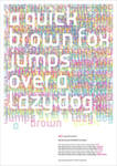
Pangram
A Pangram is a sentence that contains all letters from an alphabet. They are used to display the contents of a font.
Famous pangrams are:
The quick brown fox jumps over the lazy dog (english; 26 letters)
Victor jagt zwölf Boxkämpfer quer über den Sylter Deich (german; 26 letters + umlaute)


Quotation Marks
Are punctuation marks to indicate speech or highlight a word or phrase. They are also called inverted commas and they come single or as pair.
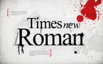
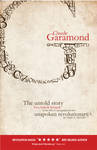
Roman Type
The name derives from ancient Rome and inscripted type. One of the main features of Roman Type are Serifs. Famous fonts are: Bembo, Baskerville, Caslon, Bodoni, Times New Roman and Garamond.
Today: #1 // I - R.
Read and enjoy
I
Initial
Stands at the beginning of a copytext; a chapter or a paragraph. It is considerably bigger than the rest of the copy, usually several lines high. It can be a simple letter or an decorated character.
A fine example of creating initials is the Daily Drop Cap Blog by Jessica Hische.
:thumb103628124: :thumb169289561: Italic
Is a cursive font style based on handwriting. The typeface is usually slanting to the right, on serif fonts serifs and vertical lines may become rounder and curvy; on sans serif fonts occasionally serifs are added on the italic style.
It is supposed to be the handwritten version of the typeface in use, therefore it is curvier and slanted.
J
Justificatiion
Describes the alignment of text in a column or text field, that is neither left or right aligned or centered, but forms straight lines at the left and right of the column or text field. Using this can lead to disturbing gaps in the text, which has to be adjustet by changing the properties of kerning and ratio of the letters. The last line of a paragraph is not stretched to the whole width of the column, it can be left or right aligned or centered, depending on the writing system.
K
Kerning
Defines the space between 2 letters. When creating a font you define that space character pair by character pair, and it is added to the font file. You can adjust it in any graphic program manually, to get better or wanted results. Kerned character pairs are: AV WA LV LT YJ where the negative space around each letter is overlapping the other one's.
L
Letterpress
Is the well-known synonym for Relief Printing. The type is on a surface, standing out from it, in its mirrored form. Basically
iInk is added to the relief and then the paper is pressed on it. Starting on plates and using vertical pressure, nowadays the relief is attached to drums using rubber and the paper is moving through them.
The letterpress technique was developed by Johannes Guttenberg in the 15th century. It marks the beginning of a new era of history, colliding with the Renaissance, the discovery of America and the Reformation.
Ligature
A combination of 2 characters from a typeface. Related to Glyphs, a ligature is only a letter combination. Some languages contain ligatures per defintion, for example æ œ ü ä ß & (nordic languages).
Lorem Ipsum
The most famous placeholder text. It is derived from latin, but has been transformed in order to make it meaningless. You use it when you either havent received a copy text yet or the main focus in on the design and layout and not on the text.
M
Mean Line
Mean Line, Midline or Median defines the top end of lowercase letters in the structure of a typeface. The letter to measure this line is the "x". Round letters end slightly above this line, because it is more pleasing to the eye. If that would not be done, rounded letters would appea smaller then non rounded ones.
Microtypography
Is the technical term for improving the readability of texts. Especially justified texts need manual adjustment to avoid typographical or aesthetical mistakes. You can change many features of a text to improve it: Kerning, hanging punctuation, hyphenation or tracking are the most useful points of adjustement.
N
New or Neue
If you find a typeface that contains New or Neue (German) in its name, it usually indicates a new, modified and possibly improved version of a font.
Negative Space
This can both refer to the "empty space" on a page or the space around letters. Usually you refer to it when white type is displayed on colored backgrounds. In printing you do not print white on black, simply because it is impossible, but the white is left out from printing. The smaller the type, the higher the chances for ink to run into the type; so typographers try to avoid using it in Microtypography.
However each character of a typeface has a typical Negative Space. If you take the A and imagine a rectangle around it, you get Negative Space at the top corners of that rectangle. At the V it would be the bottom corners. The Negative Spaces of A and V can overlap if their Kerning is adjusted.
:thumb149909327: O
Open Type
Is font format used for computer fonts. It has been developed by Apple and licensed by Microsoft. You recognise a Open Type by its .otf or .ttf ending. Open Type fonts can be used on most computer systems.
P
Pagination
Simply is the numbering of pages. Traditionally it is added to the outside bottom corners of pages.
Pangram
A Pangram is a sentence that contains all letters from an alphabet. They are used to display the contents of a font.
Famous pangrams are:
The quick brown fox jumps over the lazy dog (english; 26 letters)
Victor jagt zwölf Boxkämpfer quer über den Sylter Deich (german; 26 letters + umlaute)
Q
Quotation Marks
Are punctuation marks to indicate speech or highlight a word or phrase. They are also called inverted commas and they come single or as pair.
‘…’ “…”
In most typefaces the opening mark is shaped like a 6 and the closing one like a 9. In the english language both are aligned at the top; for example French uses Guillemets « … » while German uses Anführugnszeichen „…“ , where the opening marks are 9-shaped and aligned at the bottom and the closing marks are 6-shaped and top aligned. You can find an overview of quotation marks at wikipedia.com.R
Roman Type
The name derives from ancient Rome and inscripted type. One of the main features of Roman Type are Serifs. Famous fonts are: Bembo, Baskerville, Caslon, Bodoni, Times New Roman and Garamond.
What happened?!
Holy fucking shit I have not been here in a while.
Just saw on twitter a new theme was out and naturally I got curious.
Turns out in February I got a spike in pageviews, starting Feb 17th until Feb 27th, with hovering just around 1K a day and then from 1.200 on 27th to 63 on 28th
So yeah, no idea what happened, I did not get a DD for a deviation that's more than 2 years old, that I can figure out.
Also I had to delete 1K mentions, because roughly 900 of them were the same person using on a daily basis to wish people a happy birthday.
If anyone can explain this, please do, or I will forever not know.
That said, what else happened? Not
Lots of freebies on my (new) blog!
In an attempt to make the most stressful holiday of the year even more stressful I decided to have a big freebie event at my blog. Every day until the 24th I will be posting new free items for everyone to download.
Check out my blog to learn about the freebies!
Today is a special day, it is December 6th and St. Nikolaus day, so the freebie today is especially big. It contains samples from previous products I released, some new items and some old items that are available for free already.
Here's a link to the post with the big freebie!
The entire website is actually new and fresh with the blog and it's homepage. It contains all the big way
About that Kiriban... and other things first.
The Sunday through to Saturday feature is postponed for next week. I have not had the energy to focus on it this weekend. I don't want to go into detail, I think you are all aware of the horrible things that have happened in this world in the last week, and I am not one to virtue signal. Most of the time I am torn between lost for words and anger.
Meanwhile I am working on a few commissions, so at least I can get busy with that. I want to open up more in the future, as mentioned in the previous journal.
Speaking of the previous journal.
After a long deliberation I decided to not give out the points.
Why?
Because someone manipulated my pa
Kiriban caught!
I think it's time for a personal journal!
You didn't see that one coming, did you?
Obviously now that I decided to write this journal I forgot what I wanted to say.
Oh, right!
Kiriban at 333.333 pageviews!
It is about 2000 views away, which is about 20 days judging from my daily pageviews, so I suppose I will reach it end of July or early August.
If you reach it, take a screenshot and note me with it.
Actually even if you don't hit it exactly, I am probably letting win whoever came the closest.
Wait, win?
Yeah, you can win something. I've collected quite a few of points that I cannot transfer to Paypal, so I thought I should share them
© 2011 - 2024 pica-ae
Comments5
Join the community to add your comment. Already a deviant? Log In
Lorem Ipsum
The most famous placeholder text.
I thought that placeholder was "kdjfskdfjsldkjfsdkjfsdjkfsdkjfsdkfjsldkjfsdkjfsldkfjskdjlskdjf"
Great dictionary you got there and it looks professionally designed and the definitions are informative without being too complex <3
Great job
The most famous placeholder text.
I thought that placeholder was "kdjfskdfjsldkjfsdkjfsdjkfsdkjfsdkfjsldkjfsdkjfsldkfjskdjlskdjf"
Great dictionary you got there
Great job